


 Population pyramids take a snapshot of population in a single moment in time and break it up by age and sex. This data can reflect a lot: historical moments, political policies, economic changes, and even the story of people moving in and out of a place. Investigating how migration is impacting population data can provide even deeper understanding about the underlying issues that are shaping a population pyramid, and about population trends around the world.
How is Migration Reflected in Age Structure Diagrams? Four Examples
In this blog we’ll take a closer look at population data for four different countries looking specifically at impacts to population pyramids from migration. In some cases, migration trends are visible in a traditional population pyramid format with population data divided by age and sex. In other cases, it will help to further divide population data into foreign-born and native-born, or to compare population at two different moments in time. These four examples showcase common push and pull factors, how those factors drive migration, and how migration trends are reflected in age structure diagrams.
1. Sint Maarten: Push and Pull Factors in One Pyramid
The small nation of Sint Maarten in the Caribbean only has about 44,0000 citizens. It is a part of the Kingdom of the Netherlands and shares an island with Saint Martin, a Republic of France. In 2017, climate warming intensified hurricanes in the Caribbean, and Hurricane Irma devastated the country and economy. Sint Maarten struggled to rebuild infrastructure after the storm, and as a result, housing costs increased. Today, growth of the tourism industry, along with a small land area, also drives up the cost of living for locals. The tropical country is a magnet for retirees from the Netherlands (technically not immigrants, since Sint Maarten is a part of the Netherlands) and North America. But the locals that leave cite the high cost of living, high unemployment for young people, and a lack of educational opportunities as pushing them off the island.
In Sint Maarten’s population pyramid below (figure1), the immigrants and Dutch retirees contribute to the large older population bulging at the top. Emigrating young adults leave the country for educational opportunities abroad and a more affordable cost of living as early career professionals. Their absence pinches the pyramid for 20- and 30 year-olds.
What are the Key Factors Impacting Sint Maarten’s Population Pyramid?
- Migration push factors: rising cost of living, limited educational opportunities
- Migration pull factor: a desirable place to retire
- Countries sending migrants: (the Netherlands, not technically a separate country), the Dominican Republic, Haiti
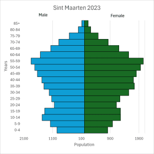
Figure 1: United Nations, Department of Economic and Social Affairs, Population Division. (2024). World Population Prospects 2024: Sint Maarten population and demography profile. UN DESA Data Portal. un.org.
2. Qatar’s Migrant Workforce
Qatar’s population pyramid is one of the most unusual-looking pyramids of any country today. 95% of Qatar’s workforce is made up of migrant workers, the highest percentage of foreign-born workers in the world. Most of these migrant workers are young and middle-aged men attracted to the booming construction industry. Immigrants also fill jobs doing domestic work, hospitality and service, and increasingly higher-skilled jobs like educators and engineers.
Qatar’s large working-age population did not happen by chance. Qatar is one of the world’s largest exporters of liquified natural gas and has one of highest GDPs per capita in the world. Rapid development of infrastructure attracts migrant labor, with recruiters promising high wages, no income taxes, access to healthcare, and other welfare benefits. But immigrants to Qatar are afforded few legal protections, leading to widespread reports of exploitation, entrapment, wage theft, and abuse.
In figure 2 below, immigrants to Qatar are shown in lighter colors, and native-born Qataris are in darker colors. (There is not population data for ages 15 years and younger that distinguishes between Qatari-born and foreign-born, so all children younger than 15 are in a single grey color.) Hundreds of thousands of men in their 20s and 30s immigrate to Qatar and appear as a giant bulge on the male side of Qatar’s population pyramid. There’s also a noticeable bulge on the female side of the pyramid, with immigrants far outnumbering Qataris, though the female side’s bulge isn’t nearly as pronounced as the male side.
What are the Key Factors Impacting Qatar’s Population Pyramid?
- Migration pull factor: Job opportunities
- Top countries of origin for immigrants: India, Bangladesh, Nepal
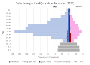
Figure 2: National Planning Council of Qatar (2021). Economically active population ages 15 years and above by nationality, gender, and age group. Economically inactive population ages 15 years and above by nationality, gender, and age group. Population Estimates by Gender and Age Groups. Qatar Open Data Portal. https://www.data.gov.qa/pages/homepage/. Ages 15+ are divided between immigrant and Qatari-born males and females for each age cohort. Data for under 15 years old does not distinguish between native and foreign born.
3. Nepal Emigrants
For decades, Nepalese have been migrating out of the country in search of employment and educational opportunities. Emigration for work is such a big part of Nepal’s economy that remittances make up nearly one-third of their total GDP. Over 80% of all Nepalese emigrants are male. Female emigrants also seek employment abroad, though a higher percentage of females travel for educational opportunities. Neighboring India receives many of the Nepalese emigrants. But in recent years, the percentage of Nepalese moving to Middle Eastern countries surpassed those traveling to India. Qatar is one of the top countries receiving Nepalese emigrants today.
In Nepal’s population pyramid below (figure 3), the darker bars represent the Nepalese population living in Nepal. The lighter bars represent Nepalese living abroad: the emigrants who moved to countries like Qatar. (This number is probably undercounted, and the lighter bars mostly likely extend farther than is shown here.) Not all emigrant Nepalese are in Qatar; nor are all the immigrants in Qatar from Nepal. But comparing the two pyramids side-by-side shows a relationship between this shared push/pull factor. A large chunk of Nepalese working-aged males in their 20s and 30s (and females, to a lesser extent) correspond to a large number of male immigrants in their 20s and 30s in the Qatar pyramid. These people are traveling from places like Nepal to places like Qatar searching for job opportunities.
What are the Key Factors Impacting Nepal’s Population Pyramid?
- Migration push factors: limited jobs, lack of educational opportunities
- Top destinations for emigrants: India, Saudi Arabia, Qatar
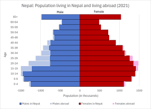
Figure 3: Data used with permission from Geoff Childs, Sienna Craig, Sonam Lama, Tashi Wongdi Gurung, Yungdrung Tsewang Gurung, Pamo Gurung & Namgyal Ngodrup (2026) Diverging migration patterns in Nepal: demographic analysis and local reflections on social change, Asian Population Studies, 22:2, 186-203, DOI: 10.1080/17441730.2025.2544679
4. Impact of War in Ukraine
When Russia invaded Ukraine in February 2022, millions of Ukrainians sought safety in neighboring countries. As many as 6 million people poured across the borders into Poland, Romania, Hungary, and other European nations. In addition, an estimated 500,000 Ukrainians soldiers and 17,000 Ukrainian civilians have died in the fighting to date. These impacts are reflected in Ukraine’s population pyramid.
In figure 4, population data from after the war started is superimposed in a darker color over population data from before the war started. For all ages both male and female (except the oldest), there are fewer Ukrainians in Ukraine since fighting began. Most of these people migrated to neighboring countries in search of safety.
What are the Key Factors Impacting Ukraine’s Population Pyramid?
- Migration push factor: war
- Top destinations for emigrants: Poland, Romania, Hungary
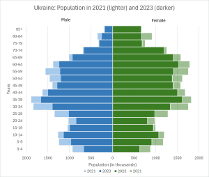
Figure 4: United Nations, Department of Economic and Social Affairs, Population Division. (2024). World Population Prospects 2024: Ukraine population and demography profile. UN DESA Data Portal. un.org.
Highlighting Migration Trends in Population Data
Population pyramids are a powerful way of visualizing data and analyzing trends. Migration patterns impact population data in a variety of ways. By separating total population into foreign-born and native-born, or by comparing population at different points in time, or even just analyzing a simple population pyramid graph, migration trends can pop into stark relief. These migration trends are critical to understanding how countries are growing, shrinking, or stabilizing. Combining a knowledge of push and pull factors help explain discrepancies and imbalances in population data and tell a complex story of our mobile global family.
A special thank you to Dr. Geoff Childs of Washington University in St. Louis for generously sharing his team’s research and data on Nepal’s emigrant population.
Image credit: Figures on passport (Photo by mana5280 on Unsplash)
Frequently Asked Questions About Migration and Population Pyramids
How does migration affect the shape of a population pyramid?
Migration can change the expected size of specific age and sex groups within a country’s population. Immigration can create bulges in certain age groups, while emigration can leave gaps in those same groups. For example, Qatar’s population pyramid shows a large concentration of working-age men due to labor immigration, while Nepal’s population reflects the departure of many young adults seeking employment abroad.
How can you identify migration patterns in a population pyramid?
Migration patterns may appear as unusual bulges, gaps, or imbalances between males and females. However, other factors that are not migration can also cause bulges, gaps, or imbalances. It helps to dive deeper into a country’s history and current events, examine push and pull factors specific to migration, and consider other geopolitical trends that can impact population. Comparing population pyramids over time or separating native-born and foreign-born populations can help make migration patterns easier to identify.
Why does Qatar’s population pyramid have more males than females?
Qatar’s population pyramid has more males among working-age adults because of its large immigrant workforce. Many men immigrate to Qatar from other countries to work in construction, the energy sector, and other industries. This creates a significant bulge on the male side of the population pyramid, particularly among people in their 20s and 30s.
How do war and forced migration affect population pyramids?
War and forced migration can reduce the population of a country as people flee conflict or lose their lives. Ukraine provides an example of how displacement and war-related deaths can alter population structure. Comparing population data from before and after a conflict can reveal demographic changes.