At Population Education, we’re always looking for real-life examples that help students digest complex topics. And teaching big numbers is no exception!
An election year is an excellent opportunity to dive into real-world statistics and give students an opportunity to practice finding meaning in the massive. When it comes to election data, it can be difficult to visualize what millions or hundreds of millions of people actually look like. But by making these figures more digestible, students can better understand the scale and significance of elections.
Let’s take a look at some of the key statistics from the 2024 U.S. Presidential Election: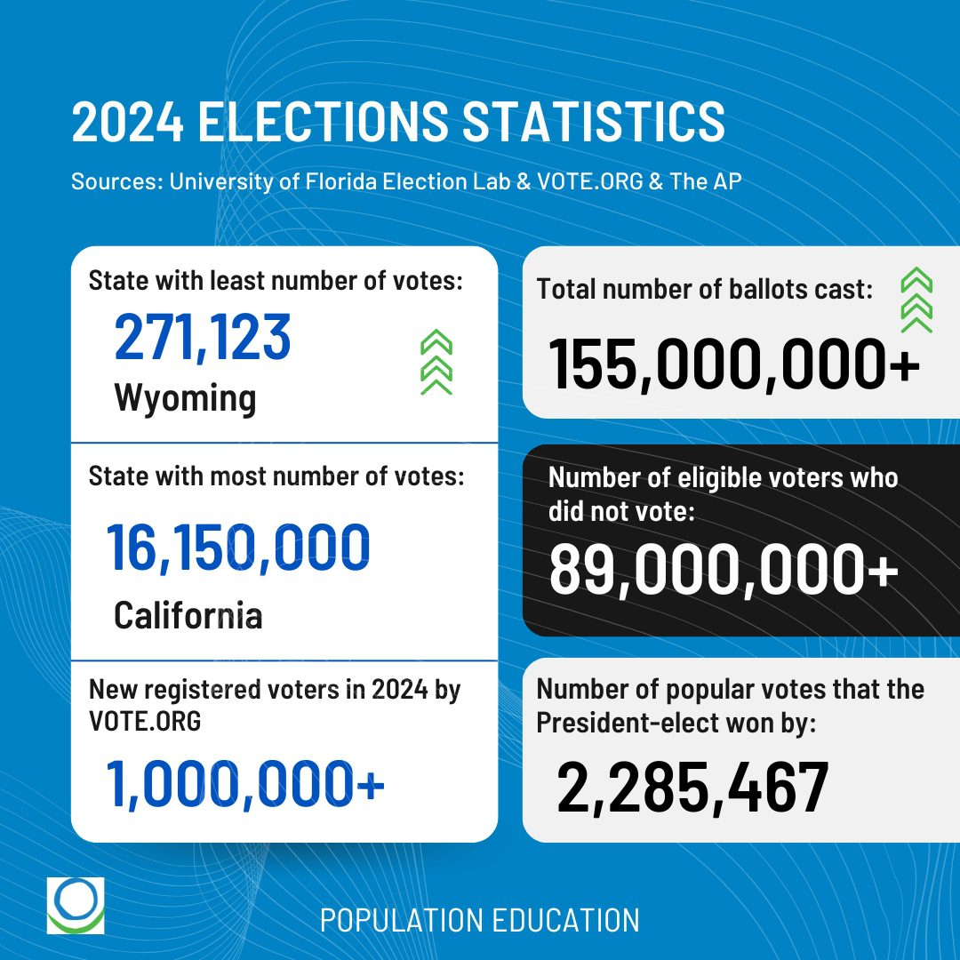
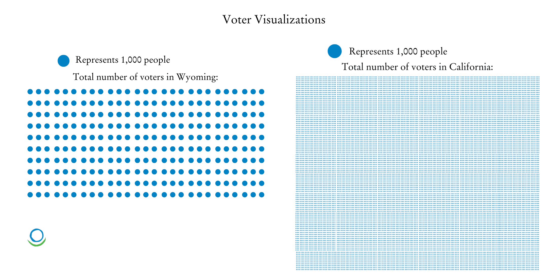
- State with least number of votes: Wyoming with 271,123 votes
- State with the most number of votes: California with 16,150,000 votes
- Number of new registered voters in the 2024 election cycle: more than 1,000,000 new voters
- Number of votes that the President-elect won the popular vote by: 2,285,467 votes
- Total number of ballots cast: more than 155,000,000
- Number of eligible voters who did not vote: more than 89,000,000
These numbers can be hard to process on their own. What can we do to make them accessible, meaningful, and perhaps most importantly, useful tools for understanding the state of our democracy?
Give Voter Turnout Numbers Context
Relating large voter turnout numbers to something more tangible allows students to make better sense of the data. Here are a few examples:
155 million ballots were cast. 155 million is about half of the U.S. population. This is a massive number, but students can visualize half of the country casting ballots to better appreciate the size of voter participation.
89 million voters did not vote. This number could fill about 1,000 stadium arenas. Think of the Super Bowl or a packed college football stadium. Then imagine 1,000 of them, and that’s how many eligible voters did not participate in the election. See more strategies for using contextual examples to break down big numbers in this PopEd blog!
If each voter represented 1 second: It would take nearly 5 years of nonstop voting for all 155 million votes to be cast!
Election Graphs and Infographics
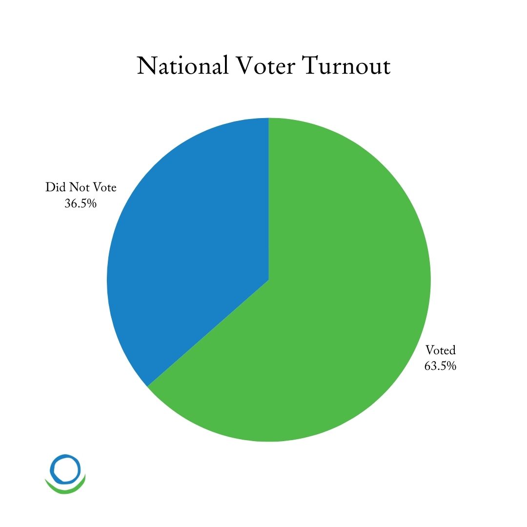
People process visuals faster and more effectively than large numbers. This pie chart is a clear visual of the voting-age population who participated (155,000,000) vs. those who chose not to vote (89,000,000). Seeing these two numbers as percentages of the population quickly boosts comprehension.
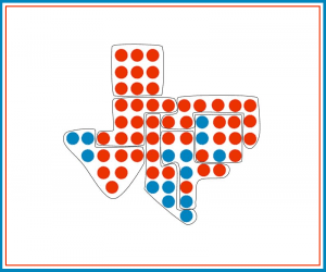
Using icons to represent a certain number of people (e.g., one icon = 1,000 people) can help students visually grasp the scale of election data. You can also use infographics to represent the demographics of voters, highlighting regions, age groups, or other significant characteristics. Here we see a visual representation of voter turnout in Wyoming and California, the states with the fewest number, and largest number, of voters respectively.
Kinesthetic activities can make abstract numbers more relatable, and they encourage engagement among students.
Engage Students with Election Numbers
Assign students different roles based on the election’s voter turnout data and then simulate an election within the classroom. For example, in a class of 30 students, 19 students would represent this cycle’s voters, and 11 would represent the eligible non-voters. This activity will physically show students what it looks like when large numbers of people are disengaged from the democratic process.
You can also use this exercise to visualize the proportion of votes that the President-elect won by. Let’s say your whole class of 30 now equals 100 percent of the vote. Trump having won the election by 1.47 percent of the popular vote is the equivalent of winning the election by about ½ a student.
Collaborative Problem Solving
Challenge students to work together and communicate election numbers by picking a statistic such as voter turnout, margin of victory, or demographic breakdown. By tasking them to communicate the meaning of this number to others in a relatable way, they can analyze data, use critical thinking, and consider how numbers impact real-world decisions and strategies.
Understanding the Scale of Elections
Election numbers aren’t just statistics – they represent real people, their choices, and their voices, and they play a powerful role in shaping our democracy. Using strategies that help students understand the scale of elections, voter participation, and civic engagement can empower them to be more involved and informed citizens in the future.


