Why populations grow is one of the most foundational questions when considering environmental and social issues, and earlier this month, we held a webinar to support educators in teaching this important demographic concept. A fantastic group of 74 teachers joined us, and we had the opportunity to share lesson plans and tools that can be used in both face-to-face and virtual classrooms. In case you missed it, here’s a quick recap of what we covered (with links to all the shared materials!).
Three Lesson Plans (with Virtual Adaptations) for Teaching Why Populations Grow
In this post, we’ll summarize the easy-to-use lessons that we shared for teaching about why populations grow and will explain how to adapt the lessons for a virtual classroom. Digital adaptations are made using Google Sheets and Google Slides and we will provide links for you to copy, use, and share with your own students. We also recorded the webinar, and encourage you to check it out – watch the webinar now!
A Visual Demonstration of the Relationship Between Birth and Death Rates
The lesson Stork and the Grim Reaper is a powerful visual, showing how birth rates and death rates interact to influence the rate of population growth. The lesson is a demonstration using two bowls of water. One bowl should be transparent (a glass or plastic Tupperware container works well) and represents planet Earth; the water inside this bowl represents our global population (it can be helpful to use blue food coloring to make the water more visible). The second bowl should be opaque so students do not see, or focus on, the water in it.
To prepare the demonstration, you will need two student volunteers, one to represent the global birth rate and one to represent the global death rate. Give the student representing birth rate the “Stork” necklace and a 1 cup measure, and the student representing the death rate the “Grim Reaper” necklace a ⅓ cup measure. (Currently, the global death rate is approximately one-third of the global birth rate.)

To start the demonstration, have the Stork add one scooper (1 cup) of water to the bowl representing our planet, symbolizing people being born, or added, to our global population. Then, have the Grim Reaper remove a scooper (1/3 cup) from the same bowl, representing people dying. The Stork and the Grim Reaper continue in turn while students observe what happens to the blue water that represents population. Students will see that because the birth rate is so much higher than the death rate (the scooper is so much larger) the water continues to rise.
Since this lesson is a demonstration, it can be done easily through a live video share in a virtual setting. To extend the lesson, try finding the birth and death rate equivalents for different countries around the world and comparing countries based on their rate of growth (or lack of growth).
Analyzing the Impact of Age-Structure Using Population Pyramids
Population Pyramids are a foundational tool for investigating population age-structures and therefore, growth patterns. In Power of the Pyramids, students are tasked with creating population pyramids for an assigned country, using provided age-sex data. The lesson provides data for six different countries – China, India, Guatemala, U.S., Nigeria, and Germany – and we recommend having pairs of students graph different countries.
Once all the graphs are completed, have each group share out, and save lots of time for analysis and discussion! Students will notice that the graphs look very different: some triangular, some more rectangular, and one (Germany) an inverse triangle. Using critical thinking, students can discuss which countries are experiencing the fastest and slowest rates of population growth, based on their pyramid shape. HINT! Countries with more triangular shaped pyramids are growing the fastest since the majority of the population is either currently in, or almost in, their reproductive years, and younger cohorts are larger than those above them on the pyramid.
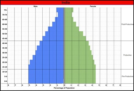
To do this population pyramid lesson digitally, have students use our Google Sheet to complete their graphing. Each tab of the Sheet has data for a different country, and students use the “paint bucket” tool to fill in bars on a pre-made graph template. Once graphing is complete, students can flip between completed country graphs to see the diversity of shapes and discuss implications.
Investigating How Societal Factors Impact Fertility Rates
There are many social and economic factors that impact fertility rates around the world. The lesson Demographically Divided World explores these factors and asks students to consider the validity of the Demographic Transition Model (DTM) and how it applies to certain countries.
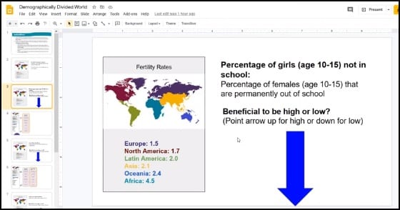
After reviewing the map overlays of fertility and life expectancy data found on the interactive site www.worldpopulationhistory.org, six students take on the role of regional representatives to share statistics on factors that impact fertility rates. Standing at the front of the classroom, each regional representative shares their region’s total fertility rate with the class. Next, representatives read statistics for four factors that impact fertility: percent of girls not in school, infant mortality rate, adolescent fertility rate, and percent of female contraceptive use. For each factor, the following sequence is repeated: regional representatives read their statistic to the class, the class discusses how and why the factor impacts fertility rates, students determine whether a higher number or lower is more ideal for lowering fertility rates, then regional representatives line up in order of least ideal to most ideal. Students take note of the orders of the regions, brainstorm other factors that influence fertility, and discuss variations in fertility within each region.
For the remainder of the lesson, students analyze the Demographic Transition Model, first learning about the model by using a data visualization from Gapminder.org and then researching an assigned country to determine where it falls within the DTM.
The first, third, and fourth parts of the lesson are already easily done in a virtual format, since they are completed using web based tools or independent research. To complete Part 2 of the lesson (where students are regional representatives), share this Google Slide deck with your students, along with the Region Cards. The six regional representatives will read statistics from their cards, and the class can discuss the statistics just as they would in person. Rather than lining up in the classroom from most to least ideal in terms of lowering fertility, a volunteer will slide the region tiles on the Slides into the correct order for each factor. To review the concept of the DTM, try this interactive tool using a Google Slide where students slide DTM characteristics into columns for the appropriate DTM stage.
More Resources for Teaching About Population Growth
Here at PopEd we’ve been focusing on why populations grow for the past two months and have been sharing lots of helpful lesson plans, tools, and resources. To find everything we’ve shared so far, follow us on Facebook, Twitter, or Instagram and search the hashtag #PopEdWhyPopulationsGrow. Let us help make teaching this important topic easier, more fun, and engaging despite this new virtual world!