Population Education has a wealth of materials that use real-world data and teach critical analysis skills while also promoting meaningful and memorable learning. Topics like urbanization, migration, biodiversity loss, aquifer depletion, and demographic trends provide a unique opportunity for students to interpret numbers, charts and graphs while also looking for relationships between the data. For example, by what amount have reefs changed in size over the past 50 years? Or, how might literacy and infant mortality rates be impacting fertility rates? These are the types of data-focused questions we’re going to provide in the coming months.
Want Classroom Resources that use Real-world Data?
Through June, PopEd will be sharing lesson plans and other resources to help educators use real-world data while teaching timely global issues.
Follow along on Facebook and Twitter or search #PopEdTheme and #PopEdRealData for access to free classroom resources, many of which are not available on our website. Don’t miss out!
Read on for a peek of what we’ll be sharing over the next few months…
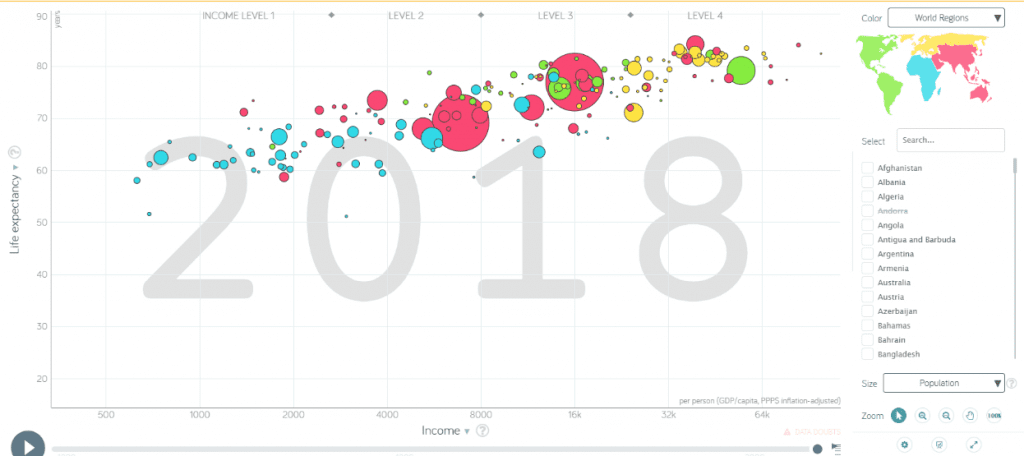
• Development in Motion (high school PopEd lesson plan): Graphic representations of world statistical trends can help illustrate changes in quality of life around the globe. Using the “trendalyzer” program from www.GapMinder.org, students analyze country data to investigate the relationship between social, environmental and economic trends over time.
• Visualizations of migration data: From Migration Data Portal, this blog highlights nine eye opening data visualizations. With migration being such a prominent issue in today’s news, this is a great jumping point for arming students with the facts.
• Fracked or Fiction (middle school PopEd lesson plan): The process of fracking to access natural gas and oil has major environmental, economic, and social implications. In this lesson, students analyze information about fracking and their sources for bias and ultimately take a stance for or against fracking.
 • A Quick Trip to 7.6 Billion poster: We recently released an updated version of our popular 2-sided poster, A Quick Trip to 7 Billion. The poster is available for free viewing and includes new infographics with updated statistics (there’s even a high res version!). Three accompanying lesson plans help students digest and analyze the poster’s information.
Why Use Real Data in the Classroom?
In today’s world, data is everywhere and the ability to analyze facts and figures is a crucial 21st century skill. In this age of information, students need to be able to decipher data patterns and relationships, and to think critically about where information comes from and how it’s presented. These skills are critical in developing an informed citizenry and they start in the K-12 classroom. We also know that incorporating timely real-world issues into instruction allows students to see the significance behind their learning which, in turn, increases engagement, creativity, and a desire to problem solve. What’s more, the use of real-world data is emphasized in the Common Core state standards, making it a win-win to include in K-12 classrooms.
Don’t forget to stay tuned on Facebook and Twitter for more great resources! #PopEdRealData #PopEdTheme
Every few months, Population Education will pick a theme and share ideas, lessons, media tools and more related to the topic. Each topic will have its own hashtag, but we’ll also use the universal hashtag #PopEdTheme to tie them all together and make it easy for you to join the conversation.