The lesson, The Pop Ecology Files, provides a fun way to integrate math and science concepts into middle school classrooms. In Part 1, students examine exponential and arithmetic growth rates, and every-day situations where growth occurs in each. Students calculate the difference between saving money so it will grow arithmetically versus exponentially. When graphed, the arithmetic growth graph is linear, and the exponential growth graph is geometric.

Part 2 has students graphing population data for six different species. All of the species data was jumbled together mistakenly and students must determine which species are which by graphing the population growth curves and matching it to location and background information provided for each species. This is particularly fun if the students are broken up into six groups, tasked with identifying their own graph, and then examining other groups’ graphs to find all six matches. An important aspect is that students be able to explain why they think each graph is for a specific species – what does a graph’s shape and scale say about the represented data?
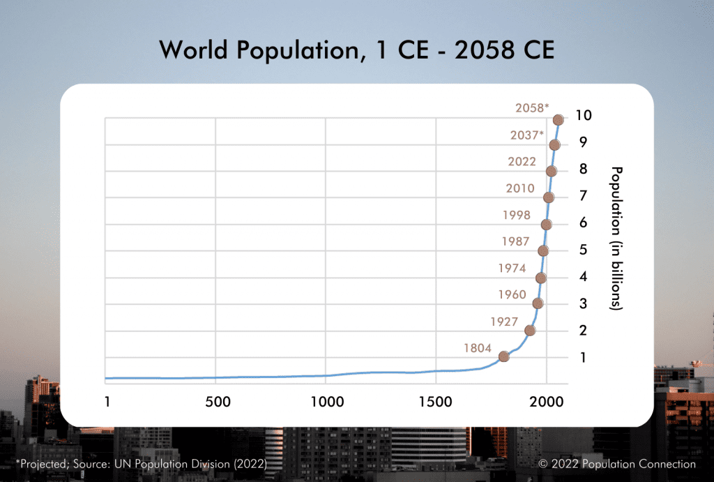
Another important component of this activity is the concept of carrying capacity. Biologists utilize graphs of populations to show growth trends – A graph that reveals an “s” shape shows a population has reached its carrying capacity. However, the graph of our human population currently looks like a classic J-curve of exponential growth as pictured. Part 3 of the activity has students graph our human population growth curve and then compare it to the species’ graphs.


