Resource Overview
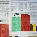
First, students interpret a graph of global population projections through 2100 from the UN. Then, students build gridded bar graphs to visually represent and compare the relative population sizes of various world regions across different years, both historical and projected. The lesson enhances skills in data interpretation, graphing, and understanding demographic trends, aligned with NGSS and social studies standards.
Use this video alongside our Population Future lesson plan for an engaging look at population distribution through data analysis. For more details on this lesson, click the green button below.