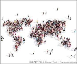
2015 marks the 70th anniversary of the United Nations’ founding. This milestone provides a marker for exploring and reflecting back on just how different the world’s demographics are today in comparison to 1945. Here are a few snapshots:
| 1945 | 2015 | |
|---|---|---|
| Global Population | 2.3 Billion | 7.2 Billion |
| Rate of Population Growth | 1.8 % | 1.1 % |
| Annual Population Growth | 47 Million | 81 Million |
| Average Life expectancy | 45 Years | 70 Years |
| Global Infant Mortality Rate | 140/1000 Births | 40/1000 Births |
| Percentage of People living in Cities | 30% | 54% |
| Number of Mega-Cities | 1 (New York, USA) | 28 |
The above statistics only tell part of the story, and with a world population of over 7 billion and growing daily life involves more than just numbers. In the recent article Mega-Cities, Mortality and Migration, Joseph Chamie, former director of the UN Population Division, posed the question, “Is the world population better or worse off demographically since the establishment of the U.N.?” This is a wonderful “essential” question for student inquiry in a secondary social studies classroom. Chamie highlights a few interesting demographic changes in particular – population distribution, global health, urban growth, and migration. And we have three suggested lesson activities that engage students in analyzing each of those areas!
Lesson plan on global population distribution and demographics
In the activity Food for Thought, students analyze various demographic statistics of five world regions (North America, Latin America, Europe, Africa, and Asia). Within each region the class is distributed in accordance to that region’s percentage of the global population. Students then explore specific population demographics, land use patterns, energy consumption and wealth both regionally and globally. The simulation creates a tangible experience for students to discuss how each of these indicators impacts quality of life and how they each vary regionally.
Lesson plan on global health
Of the major influences on population growth, public health is arguably at the very top. But what is the connection between a healthy society and its population? In the activity Unfair Race, students will represent one of 24 selected countries and move across the classroom in an adapted Simon Says – either moving forwards or backwards depending on the public health statistics of the country. The objectives of this lesson are for students to connect a country’s overall health to its social and economic conditions, and see how these conditions vary globally.
Lesson plan on urban growth and migration
Land Use Squared has students compare a population cartogram, with an equal area map to calculate statistics related to arable land, megacities, and urban population. Not only does this activity involving mapping skills but it asks students to evaluate how the physical representation of data can influence world perspectives, and then defend their claims with evidence.
Completed individually or combined into a mini-unit these three lessons provide an entry point for students to critically explore population demographics and defend their own conclusion to Chamie’s question: Is the world’s population better or worse of demographically?
Additional resources:
World Population History “Dot” Video Population Education
World Population Data Sheets Population Reference Bureau