Why do highly developed countries tend to have higher death rates than many less developed countries? This question often comes up when presenting an activity like Food for Thought, where students are comparing demographic data for different world regions. They may be puzzled to see that Europe, as a region, has a higher death rate than Asia or Latin America.
We might expect high death rates to indicate a low quality of life and be caused by poor healthcare or civil strife. While that is the case in a few countries today, it is not the norm. In fact, most developing countries have very low death rates because their age structure favors a younger population. Conversely, the most developed countries have higher death rates, resulting from a rapidly aging population.
Examples of high and low death rates
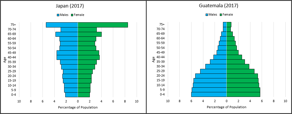
Let’s consider two highly developed countries – Japan and Italy – which both have death rates of 11/1,000 (that means there are 11 deaths for every 1,000 people in the population). A large portion of Japan’s population (28 percent) is older than 65 and Japan enjoys a high life expectancy – 84 years. Similarly, nearly a quarter (23 percent) of Italy’s population is older than 65, and the average Italian’s life expectancy is 83 years.
Compare Japan and Italy to two less developed countries – Guatemala and Bangladesh – both with death rates of 5/1,000. In both countries the segment of the population over age 65 is only 5 percent and life expectancy is 72 years. So, in these countries there is a smaller cohort of the population that’s dying off from diseases associated with old age.

When we graph the age structures, we see two radically different shapes. Guatemala is closer to a pyramid shape with the largest age cohorts at the bottom of the graph, showing a very young population. Japan’s is the inverse – the older cohorts are the largest and the younger cohorts are the smallest.
Students can gain practice creating and interpreting age-sex distribution graphs for several countries with different age structures in our lesson, Power of the Pyramids. They can also find birth and death rates for every country from the Population Reference Bureau’s site, WorldPopData.


