We’re excited to share the following post by guest blogger Dr. Merryn Cole, Assistant Professor of Science Education at the University of Nevada, Las Vegas. Dr. Cole recently taught five Population Education lessons virtually, and in this blog will explain how she modified lessons for distance learning, shared online student materials, and more. Thank you Dr. Cole!
The Need to Rapidly Adjust to Online Curriculum
 This was an interesting challenge! I had originally planned to conduct the Population Education workshop with my future teachers later in the semester, in person. Then as the university was asking us to be prepared in case we switch to online instruction, I decided to move the workshop to earlier in the semester. UNLV had other plans for me, and switched us to online/remote teaching before I had a chance to even meet with my students again. My pre-service students have enjoyed these workshops in the past, so I didn’t want to cancel the workshop. I had to do the workshop completely online.
I used WebEx for the platform, mainly because that’s the one that UNLV prefers as our first choice. I chose to cover the five activities outlined below because I could 1) facilitate the lessons live virtually and/or 2) relate the lessons back to the pandemic in some way. (Many of my students have been asking about lessons/ways to connect their teaching to the pandemic.)
Online Workshop Introduction
For an introduction, I showed a page on Canvas (our online learning platform) where students could see some basic information about Population Education, get links to the website, and see a list of things they needed for each of the upcoming virtual activities. I didn’t include the full lessons in the links but instead included what I would hand out for each one so the students could download them and work along at home.
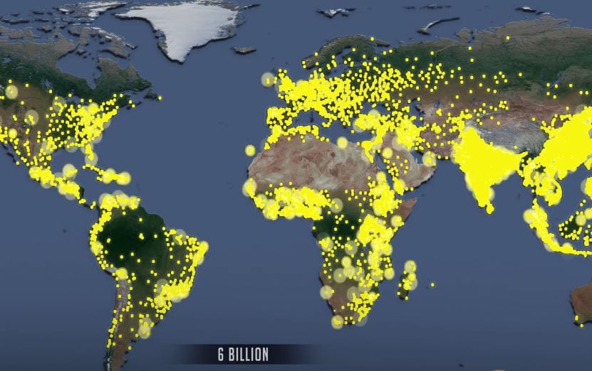
We talked about how many people they thought were on the Earth currently. They all guessed lower, thinking there were closer to 6 billion people on the Earth. Together we visited www.PopulationEducation.org and I showed them how to find lessons, how to find links to the standards, and what they’d have access to after the class.
World Population “Dot” Video: Leveraging Interactive Video for Instruction
I shared my screen and played the population “dot” video. At various points, I stopped the film so that we could discuss what was represented on the screen. We looked at the historical events listed on the video and talked about what those things were and how they related to population. We also watched as dots appeared and where. They were surprised at how long it took to get a second dot in the United States while the dots were very “active” in Asia.
The WebEx platform allowed us to draw out areas we wanted to discuss. It was kind of fun to be able to annotate while talking! It was helpful too – in addition to myself, the students were able to circle areas on the map directly, rather than trying to explain the location they were referencing.
We noted patterns in where people were living and why (which was also useful for foreshadowing the next activity). We also stopped and discussed what it meant when a dot disappears, which surprised them at first. The annotation also allowed us to talk about movement of people, drawing it on the map. I loved it, and it makes me think how much better the video could be on a SmartBoard where you could annotate. Or you could project the video onto a whiteboard and be able to write over the video that way as well.
Earth: Apple of Our Eye: Demonstration of Arable Land Over Live Video
In the past, I’ve used the lesson Earth: Apple of Our Eye in workshops with positive results. The audience seems to really like the simplicity of the demonstration as well as the connections that can be made to mathematics. I like to include it in my workshops because I can share how such a simple demonstration can become the connection for many other topics.
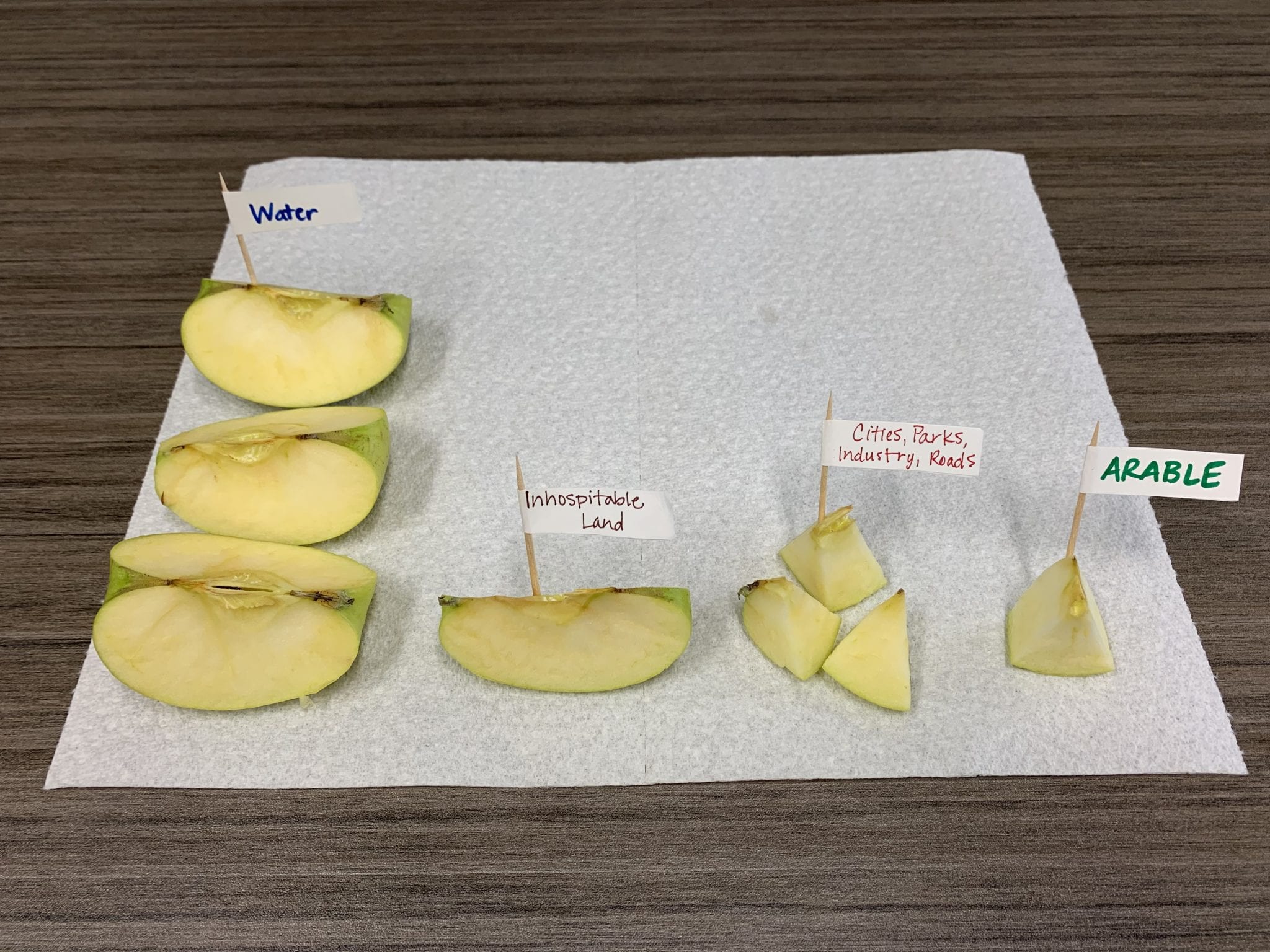
I happened to have an apple, so I cut it up in front of my webcam and did the lesson. Being in Nevada, we discussed specific connections to the desert and how little food is able to be grown here. We also talked about California, where so much food is grown but that they often have water issues.
Given that this lesson is meant to be a demonstration, it was easy to implement virtually. The only change I made, was to have to hold up both the piece of the apple I was talking about as well as the remaining apple. Sometimes this meant literally holding the pieces of apple up in front of the camera, and sometimes it means tipping my camera down at my desk to show the pieces.
Power of Pyramids: Using Google Resources for Online Learning
The Power of the Pyramids lesson took a little more planning in order to be completed remotely. We used a Google Sheet to graph and easily share our population pyramids with others. The Google Sheet would work better if I had more divisions (more than one box per number) but otherwise it was nice. It was easy to see how everyone was doing and then for everyone to easily see everyone else’s graph when discussing them. I provided the links to this Google Sheet and then to the data they needed to be able to calculate and make the graph on Canvas. This virtual version of Power of the Pyramids was one of the favorite distance learning activities of my students because they could each work on a different population pyramid and then easily see each other’s work through Google Sheets.
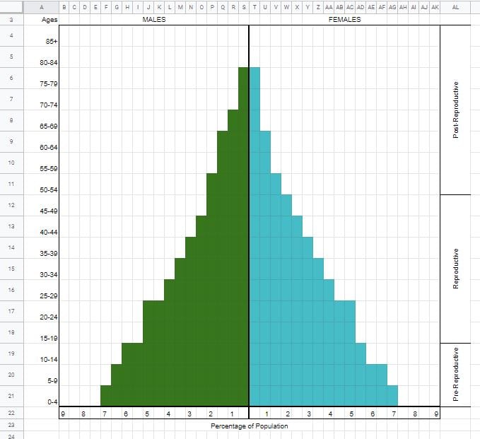
(Here is the link to the Google Sheet for building population pyramids. We followed Dr. Cole’s suggestion and added additional divisions so the pyramids are a bit less pixelated. Feel free to make your own copy of this online activity template and use it with your high school students!)
Population Circle: Easily Modify Population Growth Simulation for Distance Learning
I wanted to include the Population Circle activity because my students often struggle with teaching about exponential graphs. They’re pretty good with straight lines, but anytime the graph includes a function that produces a curve they get a bit stuck. The Population Circle simulation helps my students really see and feel what exponential growth is.
I aimed my camera down at my desk where I had placed a brightly colored notebook. The notebook served as the “Earth” and I explained what we were doing – that we’d count from 1 to 100 to show the passage of time from 1510 to 2010, and I’d place cards on the notebook at appropriate intervals to represent the increasing global population size during this time frame.
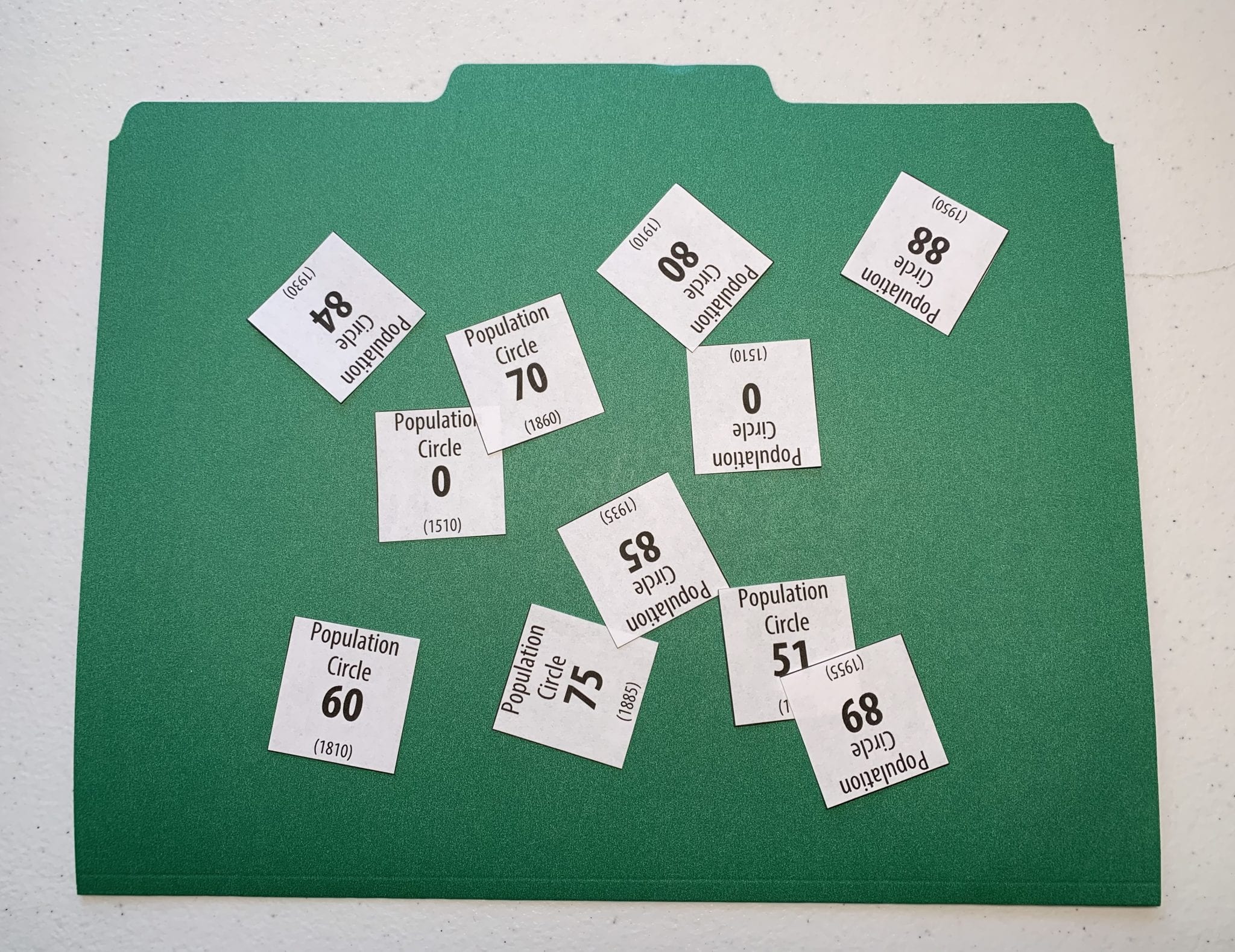
I put the two zero cards down to represent the population in 1510, and then asked them to predict how high we’d have to count before my next number. They all underestimated. Then after we got to that first card (number 51 representing the year 1760), I again asked for a guess of how long to the next card. Then we kept counting through to 100 with my putting the numbers on my notebook.
Similar to the Earth: Apple of Our Eye activity earlier, my students thought this was a great, inexpensive way to bring statistics to life and make it interesting. You can really get a feel for how the intervals change as time goes on, moving from slow population growth to much faster population growth.
After we were done, our conversation also had some direct connections to the exponential growth of the Pandemic and how nicely this illustrated that. My students made the connection between population growth and how quickly COVID-19 can spread. We talked about the reproductive rate (R0) in the population and that if the number is above one it will grow, possibly exponentially, whereas if it is below 1 the virus will slow down its spread or disappear.
Pop Ecology Files: Understanding Population Growth Curves
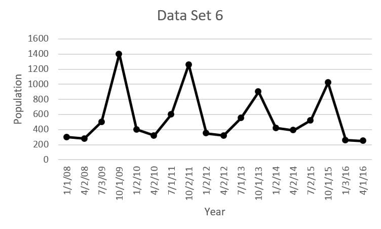 We weren’t able to fully go through the lesson Pop Ecology Files in full due to time constraints, so I didn’t ask them to do the actual graphing. Instead, I gave them the finished graphs along with the student handouts with the population data and graphing questions. We were still able to compare the six population graphs, match the graphs to the six mystery species, and discuss them.
Choosing whether to use just the graphs or to ask your participants to make the graphs themselves depends on the group and the time you have. For me, it was mainly a time issue, but another thing to consider is the graphing ability of your participants. Will they be able to graph easily, or will it take more time and explanation than the benefit you derive from it? If you are going to graph in an online webinar, I would suggest graphing in Google Sheets so that the graphs can be easily shared during discussion.
Online Workshop Conclusion
We wrapped it up by talking about how these lessons would potentially fit into their classrooms, including some ideas how they could use them now while teaching remotely. We also spent time talking about how having a more concrete example (like human population growth in Population Circle) can be helpful in understanding less tangible things (like viruses and exponential growth).
Feedback from Educators on the Virtual Teacher Workshop
One of my future teachers shared, “It’s good to use the population examples because we can connect it to other subject fields, like history or math, and possibly use them as a start to a long term interdisciplinary project.”
Another pre-service student thought, “One of the best things about the Population Education lessons is that you can relate them to carrying capacity, which is a big part of the first unit taught in Biology. A lot of students don’t immediately think of or connect to animal populations, but they connect to humans more easily making the topic more relevant. For instance, when we used the Earth: Apple of Our Eye you can see how little of the Earth is available for resources.” He said he often has a difficult time making population dynamics relevant to his students’ lives, but feels that Population Education resources could help bridge the gap.
A third future teacher really focused on the skills students learn through Population Education lessons and how they can link what is learned in different classrooms. She said, “The world map (Population Dot Video) and graphs (Population Pyramids, Pop Ecology Files) we made were good opportunities to graph, display, and interpret data. Using the interactive platform of Google Sheets made it easy to share the graphs and discuss them. It also allows for a discussion of how to collect data, whether the data is significant, or whether there are outliers.”
As I started grading my pre-service students’ unit plan assignments at the end of the semester, I have seen two units incorporate Population Education lessons, showing how they can be immediately incorporated into the classroom after learning about them in a workshop.


