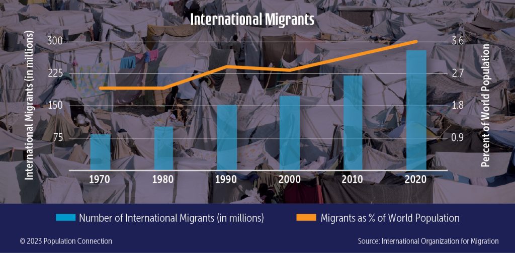
Bar chart shows the number of international migrants from 1970 to 2020, in 10-year increments. Line graph shows migrants as a percentage of the total world population from 1970-2020.
Data is from the International Organization for Migration.
Graphic originally published on the Quick Trip to 8 Billion wall chart.
Other Resources You Might Like:

This interactive social studies and geography activity has students take part in a push-pull migration simulation to identify factors driving... Read more »
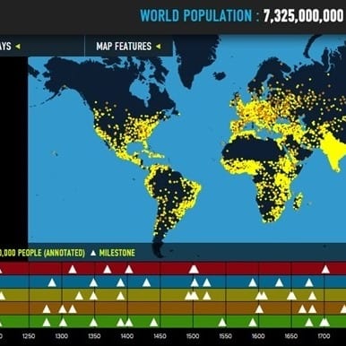
Interactive map of world population growth with annotated population "dots," data overlays, and thematic timelines.
Nice to meet you!
Tell us a bit about yourself so we can continue creating resources that meet your needs.
You’ll only need to fill out this form once. If you’ve already completed the form, you can confirm your email here.