A choropleth map displays numerical data using a color gradient. This kind of map can quickly display how a particular factor—such as population density or per-capita income—varies across regions or countries. Not only are choropleth maps easy to read, but they can be easy to create using Google spreadsheets. We did this to make maps of global urbanization for a new megacities lesson plan we’re working on here at Population Education. You and your students can follow these steps to join us as instant cartographers!
How to Make a Choropleth Map Using Google
1. Find relevant data you’d like to display. For this example, we used United Nations data on the percentage of each country’s population living in urban areas. We accessed this through World Bank’s handy data bank, which includes lots of mappable info, such as life expectancy and gender equity in education. It can also be viewed historically – we looked at data from the year 1960. Population Reference Bureau’s World Population Data Sheet is another option for detailed, annually updated, and reliable data. However, no need to limit yourself to these options. As long as you can access your data in spreadsheet form, labeled by country name, you are good to go.
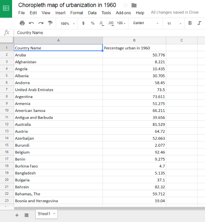
2. Open Google Drive and create a new spreadsheet. Copy and paste the data from your file. You should have two columns—one with country names and one with your relevant numerical data—in our case, the urban population percentages.
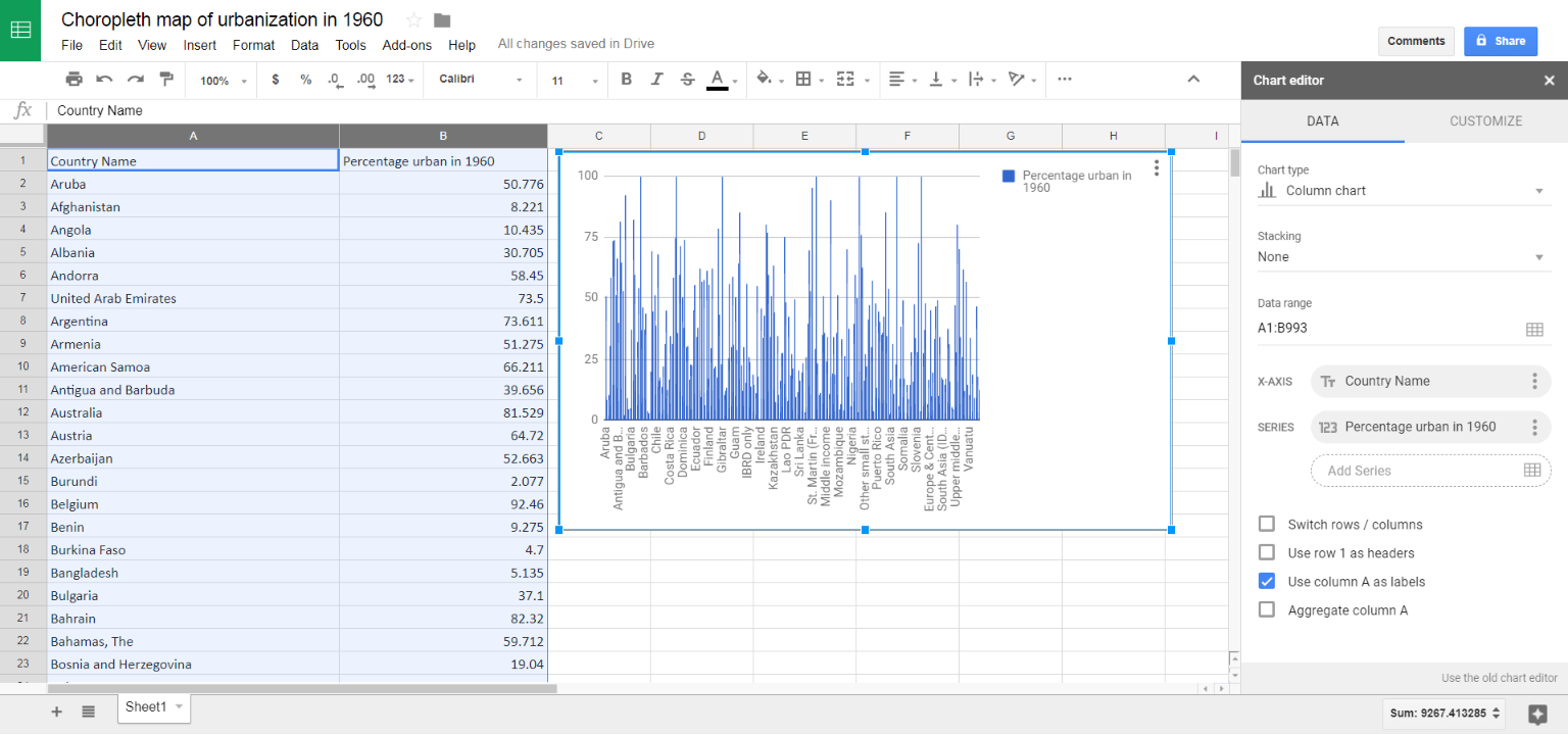
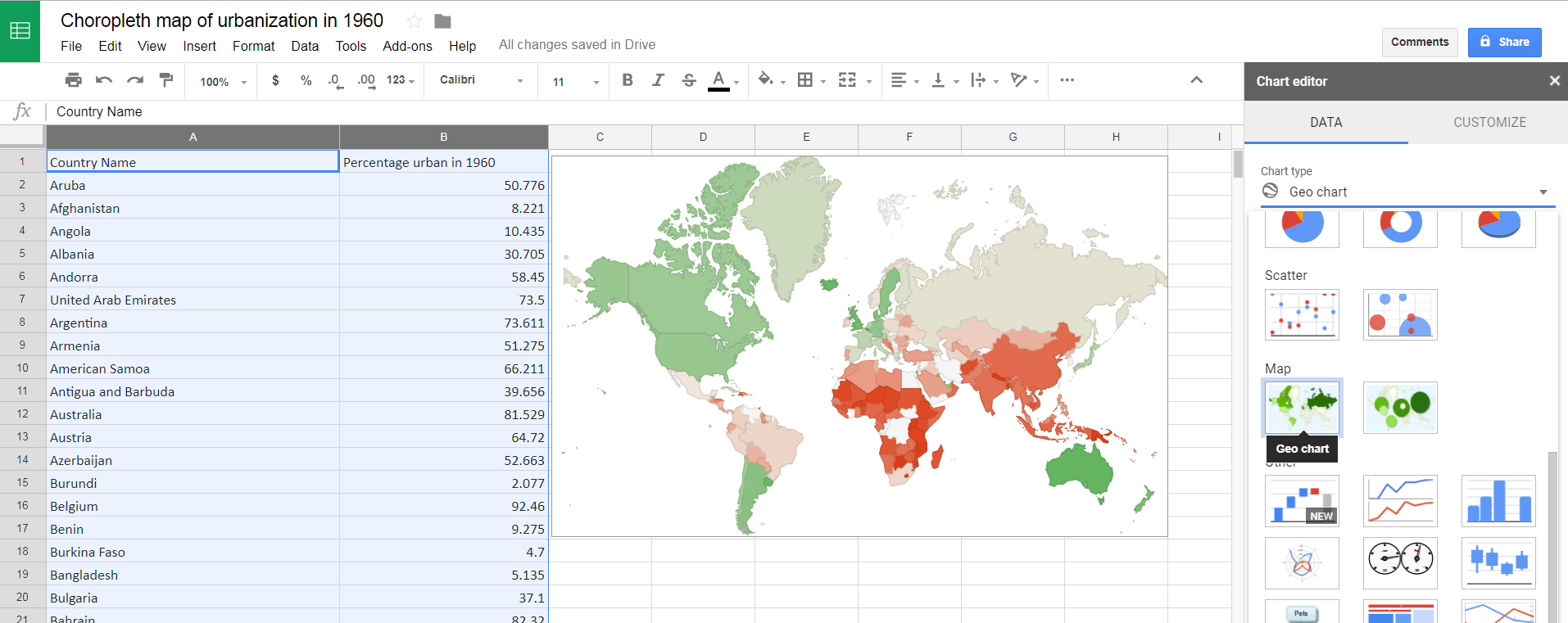
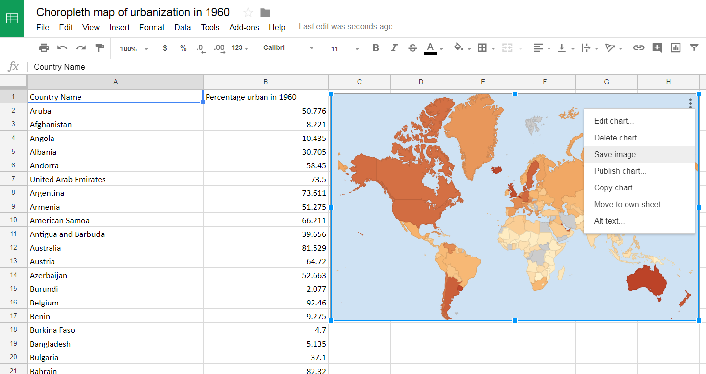
3. Highlight both columns and from the Toolbar choose “Insert > Chart.” Your data will be displayed automatically as a bar chart.
4. In the Chart editor menu that pops up on the right, go to the pull-down for “Chart Type” and scroll down to select “Geo Chart.” A map of your data should appear.
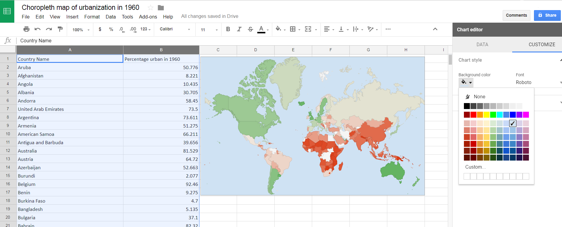
5. Use the Customize tab to select your colors. Under Chart Style, choose a background color. We suggest blue, since this makes bodies of water easier to distinguish from countries.
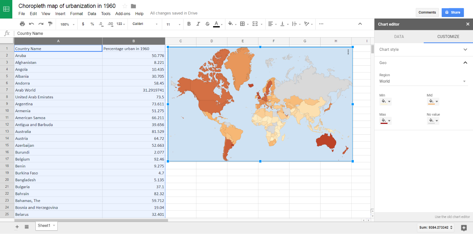
6. Under “Geo” in the “Customize” tab, select the colors to represent your numerical information. Google’s default is red and green, but that usually isn’t the best way to view your data. Typically, choropleth maps use one color or color family, with darker shades represent higher numbers. We chose light yellow for the minimum, orange for the middle, and dark red for the highest urban percentages. You can play around to see what looks best. You can also choose a color to represent countries where no data is available. (We recommend gray.)
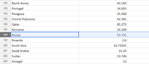
7. Spot check your data. If you see a country that’s blank, identify it using a separate, labeled map of the world. Then search your data to see if the information for that country is actually missing, or if its name simply needs adjustment for Google to recognize it. For example, we had to change “Russian Federation” to “Russia” in order for it to show up on the map, since our data was from 1960.
From this:
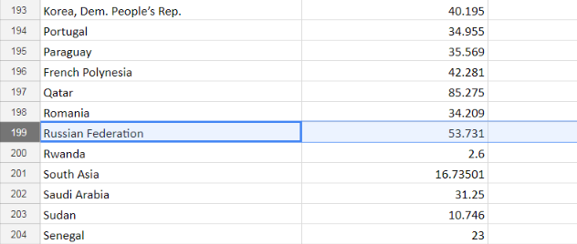
To this:
8. Once you’ve confirmed that your map is accurate, you can click on the set of three dots in the upper right corner of your map to choose “Save image.” This will allow you to download your map as a static image and use it as you please.
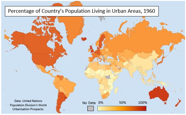
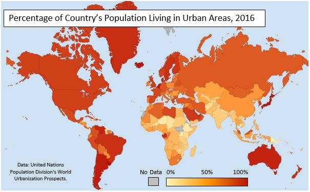
You can do a lot with choropleths – for example, make the map with the same colors for two different years to see how that factor has changed over time. This is exactly what we did for urbanization, adding a key and title in Microsoft Word.
These maps we made are part of a much larger lesson about global urbanization, part of our upcoming high school curriculum kit Earth Matters. Stay tuned and download the full curriculum soon!


