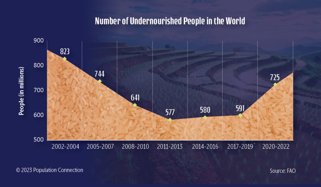
Line graph shows the number of undernourished people in the world from 2002 to 2022.
Data is from the Food and Agriculture Organization (FAO) of the United Nations.
Graphic originally published on the Quick Trip to 8 Billion wall chart.
Other Resources You Might Like:

Chips of Trade
Acting as countries in a simulation game, students discuss how resources are inequitably distributed throughout the world and how this... Read more »
Food for Thought
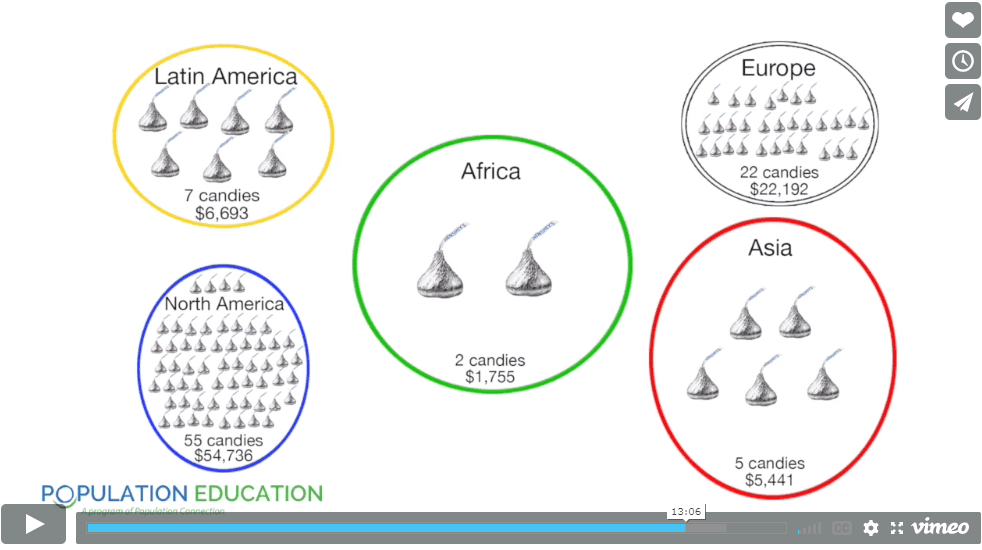
In this engaging global studies activity, students role-play as residents of five major world regions to compare key statistics related... Read more »
Nice to meet you!
Tell us a bit about yourself so we can continue creating resources that meet your needs.
You’ll only need to fill out this form once. If you’ve already completed the form, you can confirm your email here.