This post builds on our What is a Choropleth Map post from September 22, 2021. You already know the choropleths use color to represent data that is location-specific and can be a useful tool for certain analyses. Now we’re going to share some of the pitfalls to using choropleth maps to visualize and understand data.
Spotting Data Distortions in Choropleth Maps
While choropleths are useful for telling stories, they can also distort data and be misleading. Understanding limitations can be important for choosing the best type of map for your own data, and for being an informed map-reader.
Consider this choropleth map of voters during the United States presidential election in 2016. Geographic regions are broken into counties. Red counties voted majority-Republican; blue counties voted majority-Democratic.
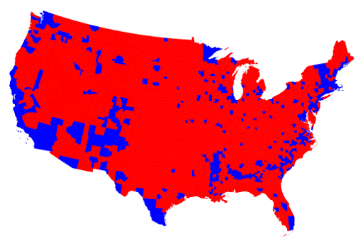
Glancing at this map, one could conclude that the Republicans won the presidential election by a landslide: most of the map is red. But that wasn’t the case. The race was tight. Many blue counties are densely populated, and many red counties were only sparsely populated. By dividing the data into geographic areas rather than population, it’s unclear how many total voters voted for each party.
Consider this next map:
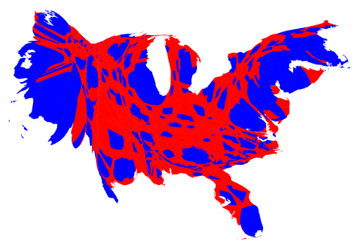
In this cartogram map, the states no longer resemble the standard view of the US. This cartogram distorts geographic areas based on another factor, in this case, population. Counties with greater populations have been stretched out. Counties with smaller populations have been condensed. Now it is easier to see how close the election was: red and blue take up more equal space on the map, representing similar amounts of red and blue voters. (For another example of a cartogram, view PopEd’s cartogram of world population here.)
The choropleth and cartogram above do not address the problem of varied data within counties. In this choropleth, different shades of purple represent counties with varying support for the Republican or Democratic candidate. This adds more nuance to the data set, but can be difficult to read. Variations in purple are tough to distinguish, and having only a few colors means only a few categories of data to compare.
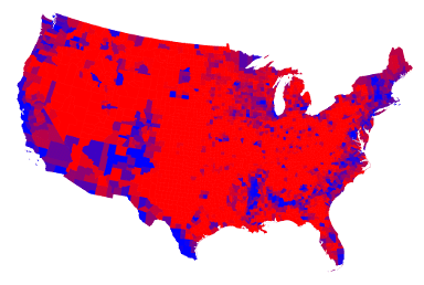
Choropleths can also create artificial demarcations or give the illusion of boundaries where there are none. In the choropleth above, there are many places where you can step over a county border and the political affiliation abruptly changes. These geographic regions make sense for a data set like voter totals, where votes are organized and counted at a county-level. But isopleth map may be a better choice for datasets like rainfall totals which are not limited by artificially created borders.
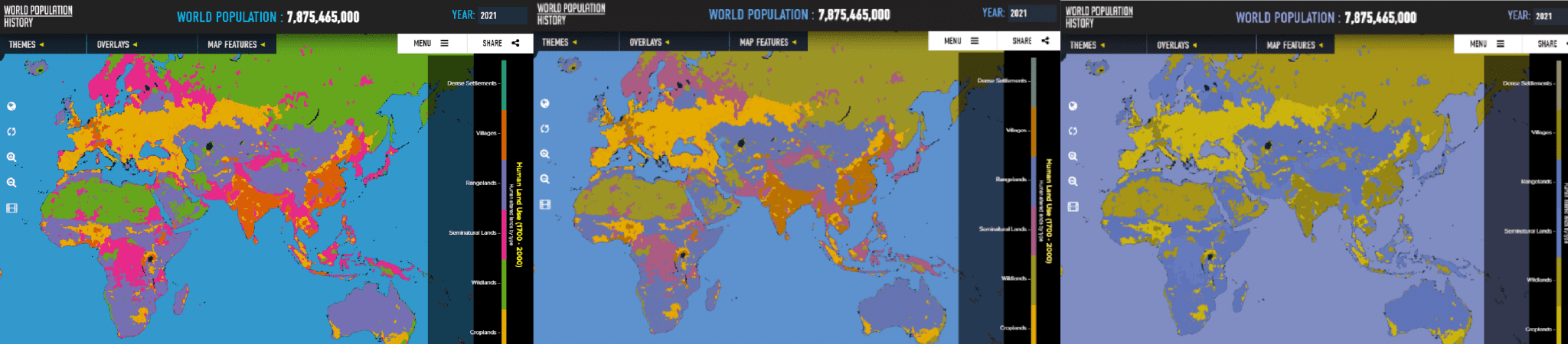
For folks with sight differences, relying on color to tell a story can also be problematic. This is a choropleth from www.WorldPopulationHistory.org of land use patterns in 2021. The first image is what someone with trichomatic or “typical” sight would see, the second image is what someone with a green-weak deuteranomaly would see, and the third image is what someone with red-weak protanopia would see. Some of the colors blend together, make distinguishing data nearly impossible. Test colors of your own JPGs and PNGs here. (Note: the map builder we used to make choropleths in the previous blog at Datawrapper.de has a built-in tool to test color spectrums for differences in sight.)
Choropleths organize a lot of information into a visually appealing format that lends itself to analysis. While they are not the best fit for all datasets, and while there are weaknesses to using this form of mapping, choropleths are still a powerful and appealing way to tell stories. And with free tools like Datawrapper.de, making your own map is easier than ever.