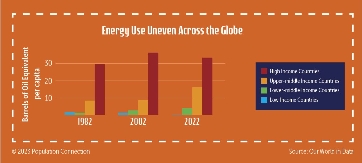
Infographic shows uneven global energy use by comparing energy used per capita in high-, upper-middle-, lower-middle-, and low-income countries. Data is displayed for the years 1982, 2002, and 2022.
Energy use data is from Our World in Data.
Graphic originally published on the Quick Trip to 8 Billion wall chart.

Other Resources You Might Like:
In this engaging climate change lesson, students collaborate in small groups to explore key environmental issues throughout different historical periods.... Read more »
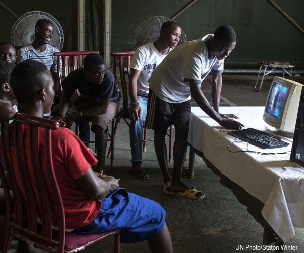
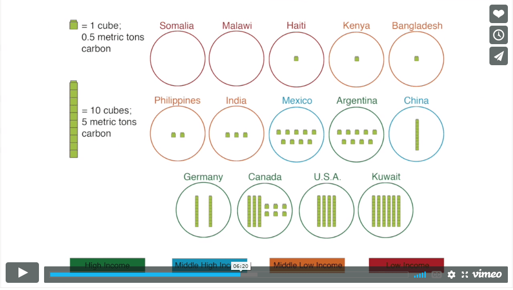
By taking on the role of a community member, students analyze how energy poverty impacts people living in Monrovia, Liberia... Read more »
Acting as residents of five major world regions, students compare various statistics that affect people’s health and well-being. Students will... Read more »
Nice to meet you!
Tell us a bit about yourself so we can continue creating resources that meet your needs.
You’ll only need to fill out this form once. If you’ve already completed the form, you can confirm your email here.