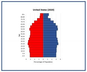
A population pyramid graphically displays the age and gender make-up of a population. As we explained in our post ‘What is a Population Pyramid,’ the more rectangular the graph is shaped, the slower a population is growing; the more a graph looks like a pyramid, the faster that population is growing.
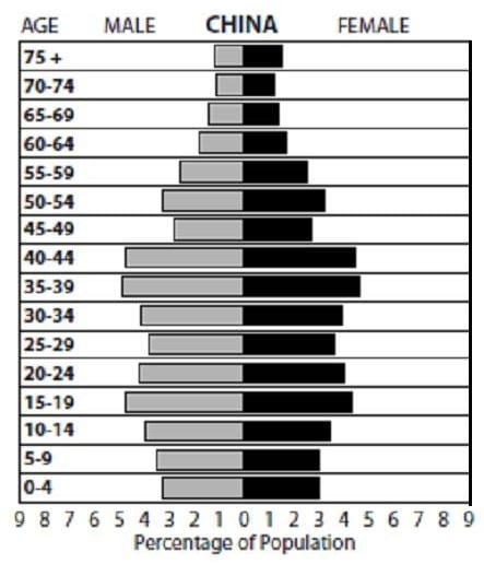
So what determines the shape of a population pyramid? Well, a lot of things. Events that took place during the 70 – 80 years depicted in the graph all have the potential to impact the graph’s shape. Economic variations (such as a depression or job growth), political changes (such as a new policy on family planning or a new tax break on dependents), conflicts (such as wars), public health trends and natural events (such as long-term droughts or an earthquake) can impact birth and/or death rates. These, in turn, influence the shape of the population pyramid.
For an example, let’s look at China’s pyramid from 2008 that is shown here. Where the graph shrinks in for the age cohorts around 50, this shows the slowing of population growth during the Great Chinese famine. After the famine, we see population started increasing again. But then, about 30 years ago, the pyramid starts becoming thinner again and this coincides with the institution of the “one child policy” that was put into law in 1979. The slight bulge in the 15-19 cohort is a reflection of the larger bulge at 35-44 (the lower bulge represents the children of the upper).
Once you know how to read a population pyramid, and understand the age-sex distribution graph, you can tell a lot about a country or region. Check out the U.S. Census Bureau for dynamic illustrations of changing pyramids for every country since 1950. (On the site, select ‘Population Pyramid Graph’ under Select Report.) Have students create population pyramids for several different countries using the activity, Power of the Pyramids.