Choropleth maps use color to show how data changes from place to place. These maps allow us to visualize information tied to geography, and to compare and analyze data from across locations. Choropleths help readers see stories in numbers: from taking data to tell a story about a student competition to looking at voter trends for insights into the political landscape.
Putting a Choropleth Map to Use
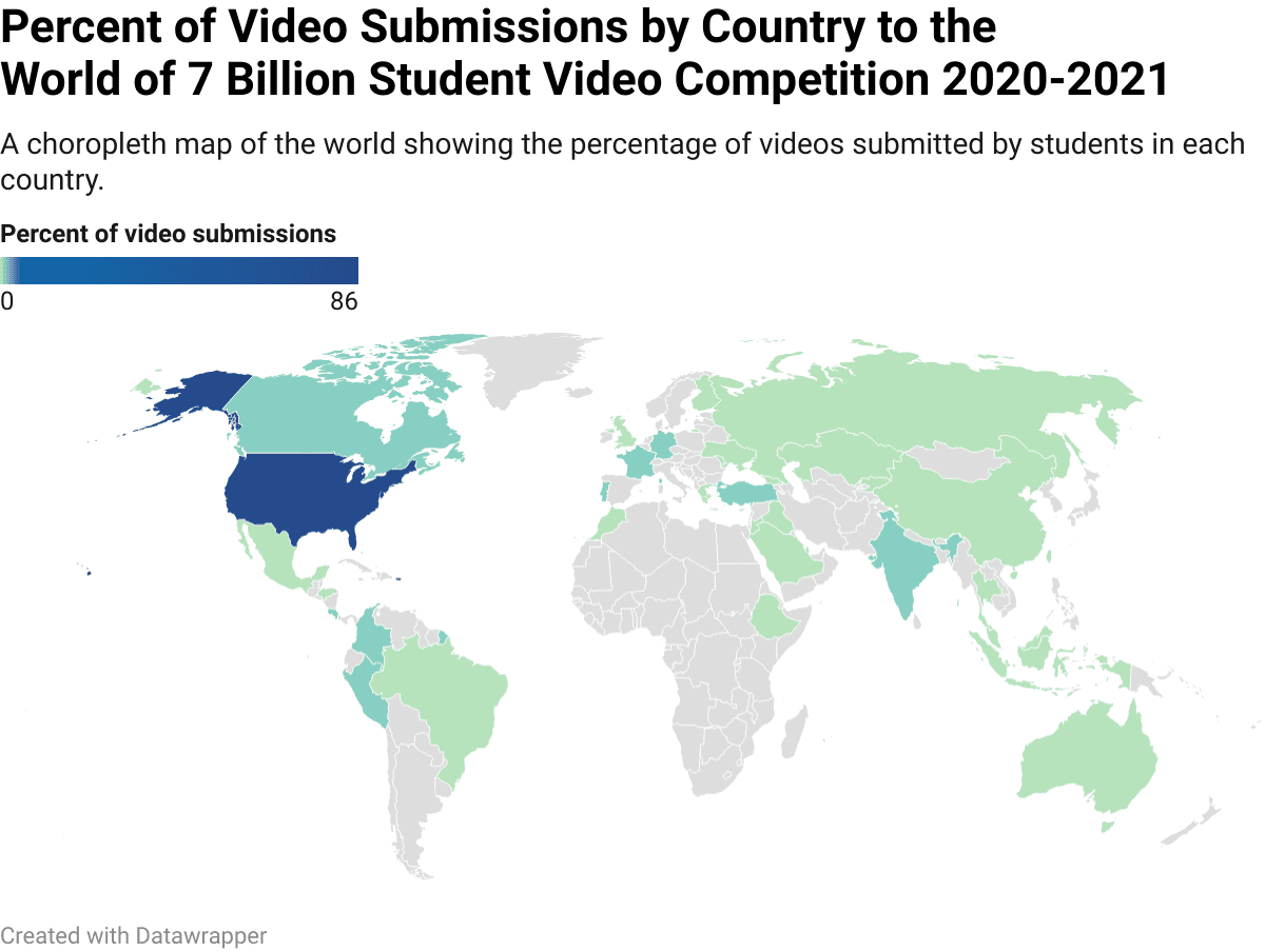
For example, Population Education’s World of 7 Billion student video competition saw over 2,200 video submissions from all around the world. We could use choropleth maps to visualize where video submissions originated. We’ll need two pieces of information to build this map: location names (state or country), and the number of video submissions from that location.
Choropleths work well with data standardized across geographic regions. Rather than use the total, raw count of videos from each location, we’ll convert the count into percentages of all of the video submissions. Ratios, rates, and percentages work well for this form of mapping. If we wanted to visualize raw counts, a proportional symbol map would be a better choice.
We used a free map-building tool at Datawrapper.de to build our choropleths. The website allows you to choose your map type, pick a region, copy and paste your data (or enter it directly), and then customize the color and data groupings. When your map is ready, you can download an image or embed an interactive version into your website or digital teaching platform.
3 Ways to Group Data on Choropleths
Choropleths can group data in different ways to highlight different trends. The contest data required some tweaking to create a visually interesting map. The majority of videos were submitted from the United States: 86%. There could be 100 colors on the map to represent each percentage between 1 and 100. Or a handful of colors could represent different groupings of data. Data is often grouped in in one of the following three ways:
- Equal intervals: the entire range is divided into a certain number of equal intervals. Four equal intervals of our percentage data would group all countries from 1-25% into one group with a unique color, 26-50% in a second group with a unique color, 51-75% in a third group, and 76-100% in a fourth. This is a great grouping strategy for data that is evenly spread throughout the range, which this dataset is not, since a vast majority of videos are from the US.
- Quartile intervals: the data points are grouped into equal-sized groups. We have data from 35 countries where videos were submitted. Quartile intervals assign one color to the 8 countries with the fewest submissions, another color for the 8 countries with the next-fewest submissions, and so on. This strategy can sometimes combine dissimilar data if there is a lot of variation or outliers. In this case, it colors the US (with 86% of the video submissions) the same color as Portugal (with 1% of submissions).
- Natural break intervals: in this strategy, countries with similar data would be grouped together. This would allow the US to be its own color as an outlier in the dataset. Other countries could then be distinguished from each other. The map above uses a natural break interval with some manual adjusting of where the breaks should occur.
Example of Quartile Grouping on a Choropleth Map
To get a more complete story of where video submissions originated, we’ll need to zoom into the United States. The U.S. data was more uniform from state to state, and a quartile grouping created a more visually interesting story. With a quick glance, we can see which states were very active in the competition, and which areas were not.
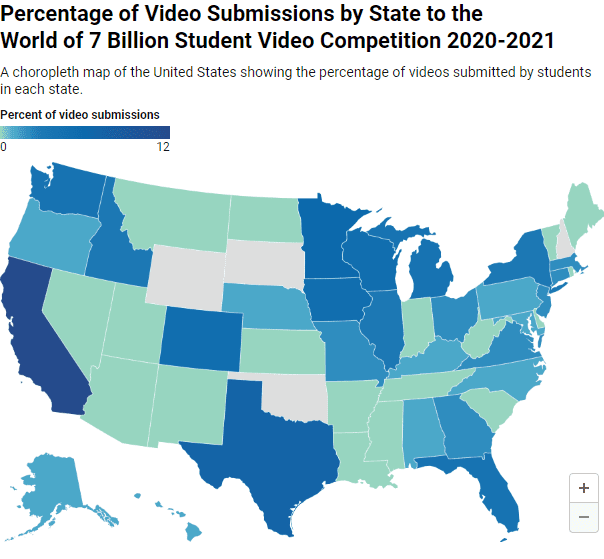
Choropleth maps like these can be a powerful tool for understanding trends and planning for the future. In the world map, we can see that partnership and outreach efforts in India resulted in a significant number of submissions from that country. On the US map, we know that the highest percentage of submissions came from California and Texas. Perhaps in future years, we’ll want to expand promotion of the contest in Oklahoma, New Hampshire, or Wyoming. Having a way to see this data tied to geography easily helps make trends visible and actionable, one of the strengths of choropleth maps.