It’s time for AP Human Geography’s unit 2, the “population unit.” And there is no better single resource to kick off APHG’s population unit than the World Population “dot” video from Population Education. Free to stream, and coming in at just under 6 minutes, the population dot video is the perfect introduction to begin your class’s exploration of unit 2: Population and Migration Patterns and Processes from the APHG CED.
Mapping and Spatial Analysis
The “dot” video depicts global population from a historic and geographic perspective. Having just finished up unit 1, your students are starting to use maps, think spatially, and explore other data representations. Challenge them to access unit 1 knowledge by asking: what type of map is used in the video (it’s a thematic map; 1.1, IMP-1.A.1) and what is the scale of analysis (it takes a global scale of analysis; 1.6, PSO-1.C.1). You might mention that the dots were placed on the map using GIS software – a nice example of geographic data being used in the real-world (1.2, IMP-1.B.2). And as you move into discussing the content, don’t forget to refer specifically to the spatial organization of the data. The video reinforces spatial concepts like relative location, space, place and pattern from unit 1 (1.4, PSO-1-A.1).
Major Population Agglomerations
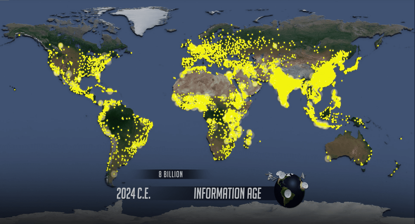
APHG unit 2 kicks off with Population Distribution (2.1), which is the exact data portrayed in the “dot” video – like we said, a perfect fit! Pause the video when the map first appears, and give students a moment to digest the world’s population distribution in 1 C.E. Point out there were two major population agglomerations at this time. (No need to go more in-depth on agglomerations, but it’s a great use of APHG vocabulary. The more APHG-rich language you can casually use in class, the better!)
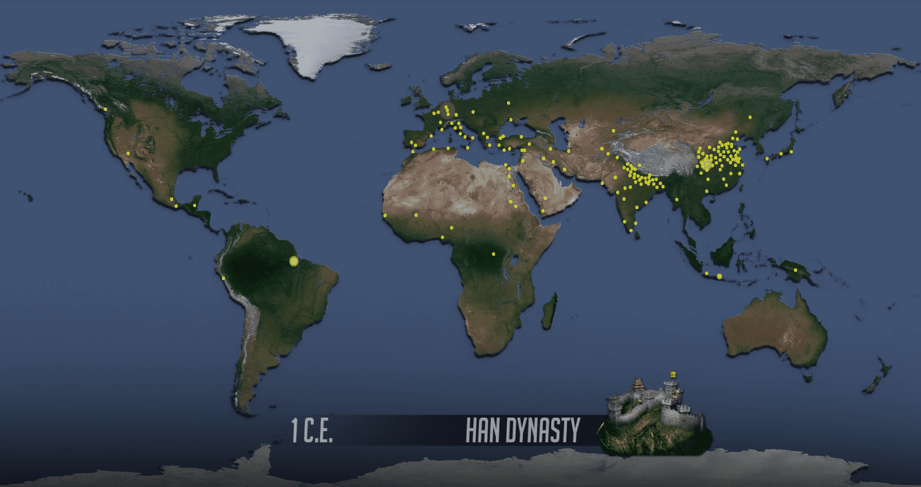
The two major population agglomerations in 1 C.E. are in modern-day India and China. It’s no coincidence that today, India and China are the world’s most populous countries. Point out other major population agglomerations as they appear on screen.
Where the Dots Are, and Where the Dots Aren’t
As the video progresses, and we see the population size and distribution change over time, students tend to really focus in on where the dots are located. But it’s also important to note where the dots are not located during this spatial analysis. (1.4, PSO-1 and 2.1, PSO-2-A.1)
Ecumene Areas of the World
Areas with dots are ecumene areas (yes! more APHG vocab!), or areas that are inhabited by humans. Where do we see large concentrations of dots, and why might people live and thrive in these regions? Students might point out that most dots are between the Tropic of Cancer and Tropic of Capricorn. This area has a more temperate climate and can support an abundance of plants and animals that humans depend on for food. Students might also mention that dots often start, and stay, near water. The Nile River is a wonderful example as it’s clearly seen by a string of population dots. Water is not only necessarily for survival but has also been vital for transportation from early on.
Non-Ecumene Areas of the World
Areas without dots are non-ecumene areas, or areas that are not inhabited by humans. Challenge students to consider why people don’t live in these areas. The map is topographic, and some easy-to-see physical boundaries make useful clues.
The Four Too’s of Population Distribution
 Ultimately, offer students the “four too’s” to remember areas where people don’t live: areas that are too high, too dry, too cold or too wet.
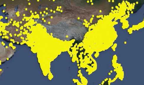
- There is a stark line where the incredibly dense dots of India and China suddenly stop. Why? These are the Himalaya mountains – high and rocky.
- There are no dots in the central region of northern Africa or the middle of Australia. Why? The Sahara Desert and Australian outback. These arid regions lack water.
- The top portion of the map is virtually void of dots. Why? The northern parts of Canada and the Scandinavian countries, as well as Siberia, are all too cold.
- We don’t see dots in the northeast portion of South America either. This is where the Amazon Rainforest is located and it’s too wet. (There is one important exception to the “too wet” rule, and that’s in southeast Asia.)
Historically, people do not live where they cannot grow food. And in areas with these four characteristics, it is extremely difficult to grow food. It would require much expense and effort, whether to build shelters, bring in energy, transport water, or beyond.
Consequences of Population Distribution
Now that students have seen the visual display of our global population distribution, they have the foundation to discuss what this all means. What are the consequences of today’s population distribution (2.2, PSO-2.D)? How does where people are located impact politics, social networks and culture, or economic systems? How does the location of people affect the environment and the natural resources on which we all depend?
Teaching Global Migration Patterns
Having just discussed the myriad ways the “dot” video fits into AP Human Geography, you might be tempted to use the film to teach about causes and types of migration (2.10; 2.11). But a word of caution: the scale of 1 dot representing 1 million people makes it difficult to see population movements unless they are especially large. For example, the migration of people from Europe to Northern America starting around 1500 is evident. The “Great Migration” in the U.S. in the 20th century is not.
Limitations of the “Dot” Video
As with any data visualization, the World Population “dot” video has its own limitations. But don’t let this deter your use of the resource – these limitations can be a benefit! Remember that in unit 1, APHG students consider how geographers utilize maps and other data representations (IMP-1). Any map use must take into account the distortions of data (1.1, IMP-1.A.3). So challenge your students to find ways population data is distorted in the video. For example, how is our understanding of population distribution impacted by the fact the underlying map is the Mercator projection? Or, students may point out there is no dot in Alaska in 1959, the year it became a U.S. state. Of course people lived there, but not 1 million, which is the threshold for a dot. How does the scale of 1 dot representing 1 million people impact our takeaways? An important part of map literacy, and data literacy in general, is decoding what maps do, and do not, tell us.
Great Video for Unit 2 APHG
As you transition from unit 1 into unit 2, be sure to take advantage of the population “dot” video. AP Human Geography teachers call it a favorite, must-see teaching resource that spurs immediate interest in, and further questions about, global phenomenon from their students. And isn’t that really what the APHG course is all about?