Infographics
The following infographics provide background information on population trends, environmental impacts, and quality of life issues from around the world and here in the U.S. These data visualizations can all be downloaded as easy to print/share PDFs or as image files that are simple to add to any format of virtual presentation.
Global environmental & social infographic collection
Data visualizations on global environmental and social trends shaping our world today and over time
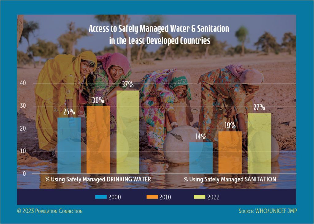
Percentage of people in LDCs with access to safe drinking water and sanitation in 2000, 2010, and 2022.

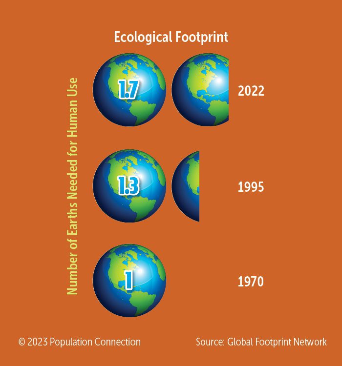
Earth graphics display human's growing global footprint from 1970 to 1995 to 2022.
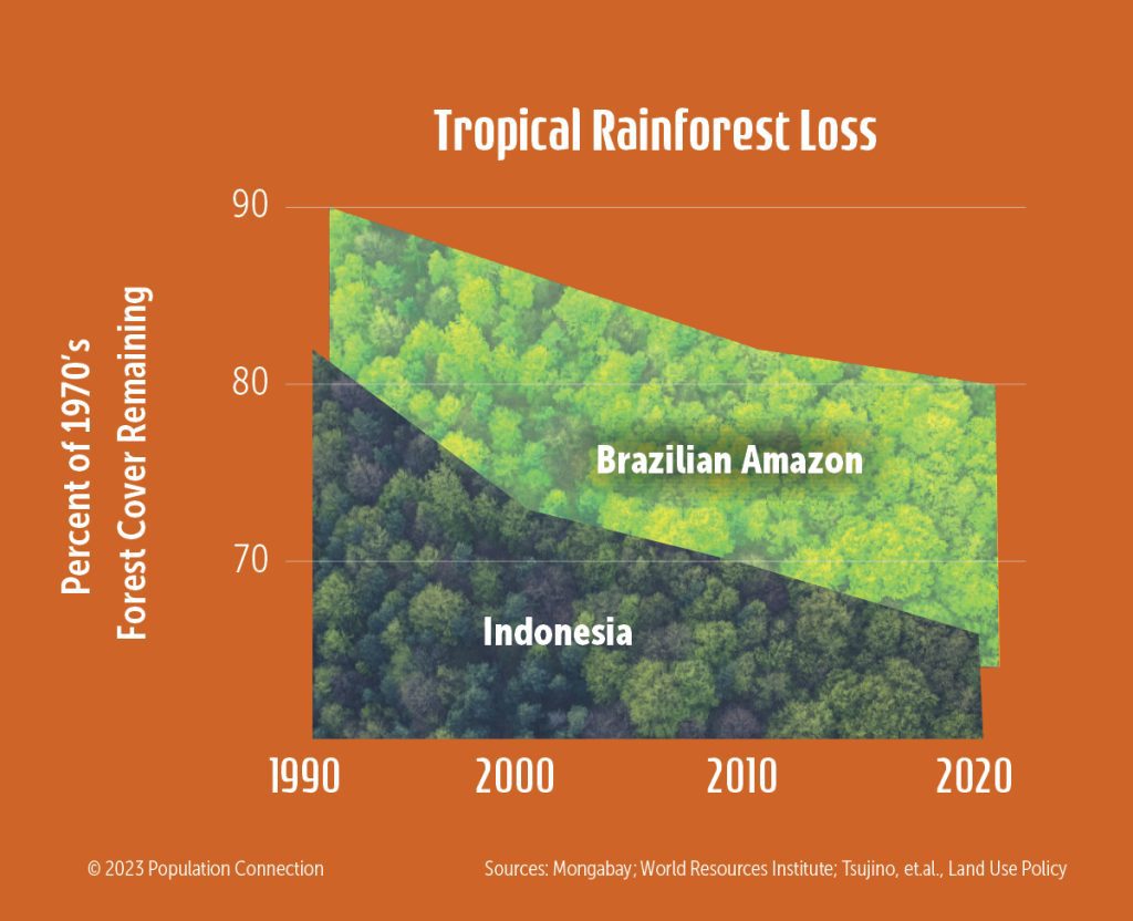
Forest loss in Indonesia and the Brazilian Amazon as a percentage of 1970s forest remaining in 2020.
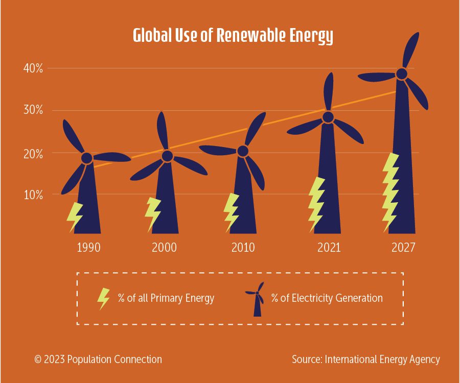
The percentage of global energy use from renewable sources has increased since 1990.
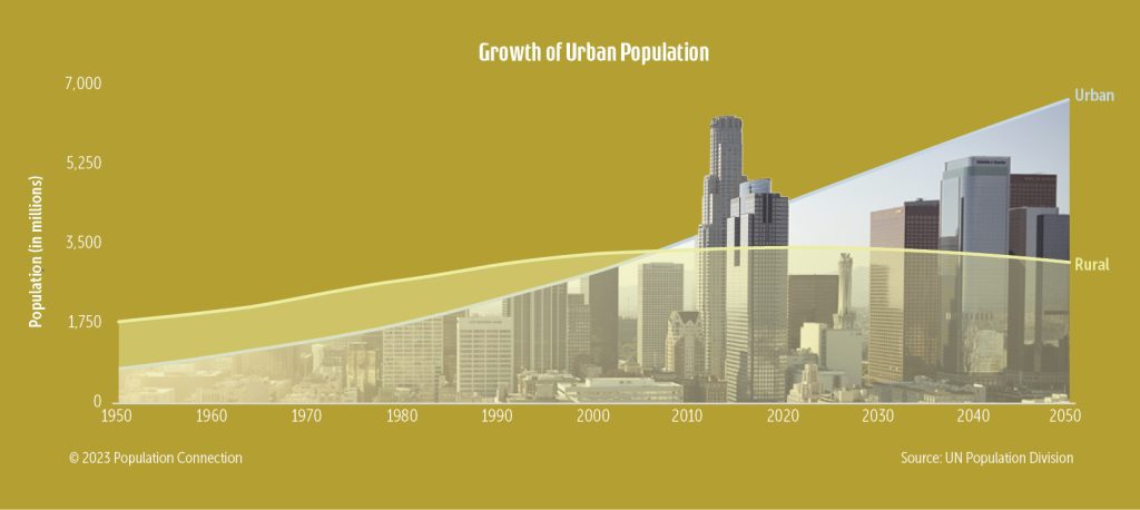
Number of people living in urban areas vs rural areas starting in 1950 and projected to 2050.
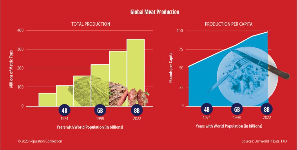
Historic production levels, per capita and total, of global meat products.
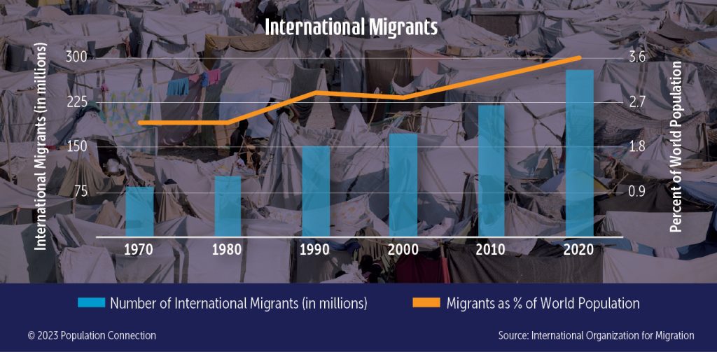
Data in 10-year increments from 1970 to 2020.
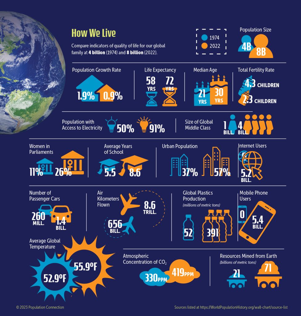
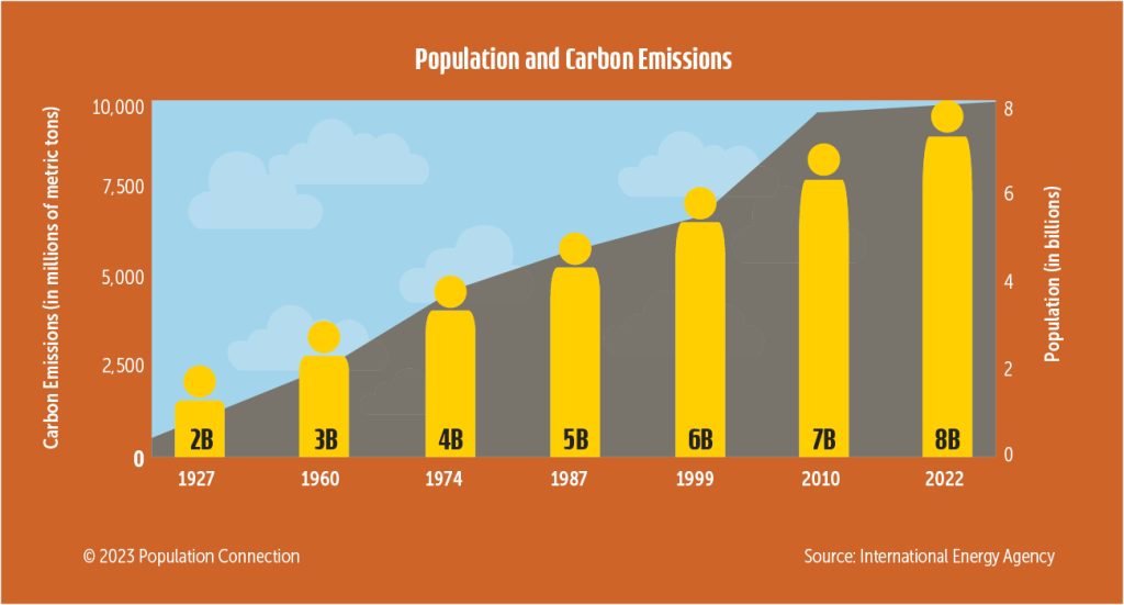
Graphics of 18 demographic, wealth, resource and impact indicators compare 1974 with 2022.
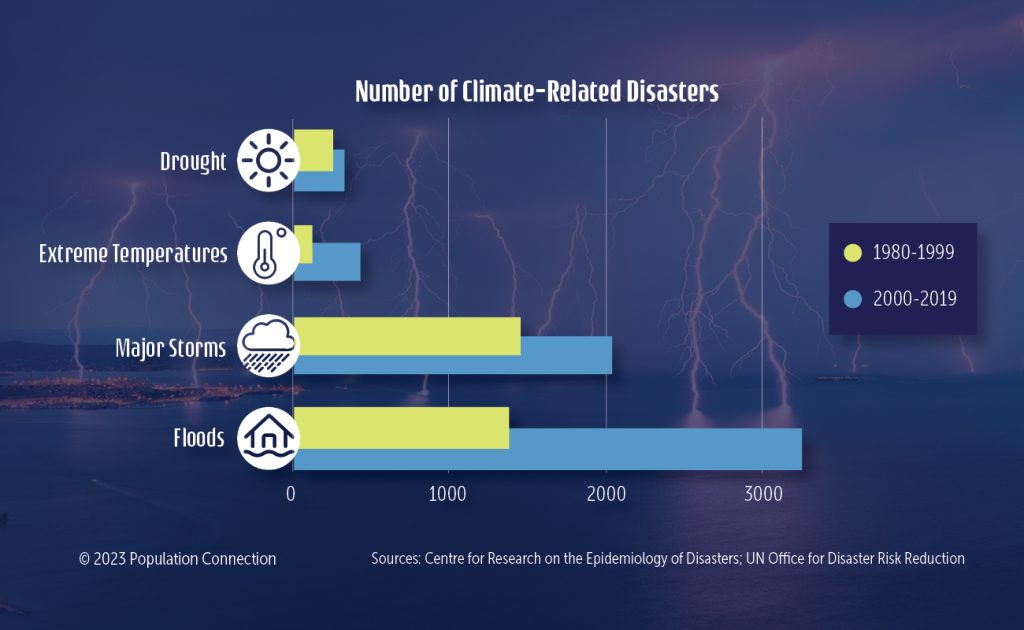
The number of droughts, extreme temperatures, major storms, and floods have increased.
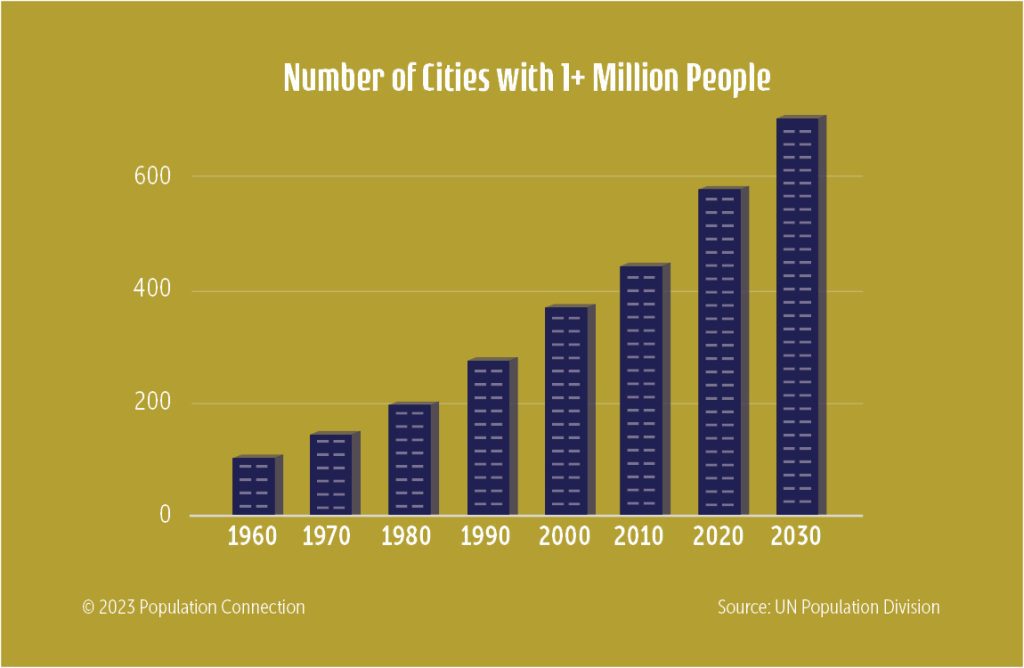
Historic growth in the number of cities with over 1 million residents from 1960 to 2030.
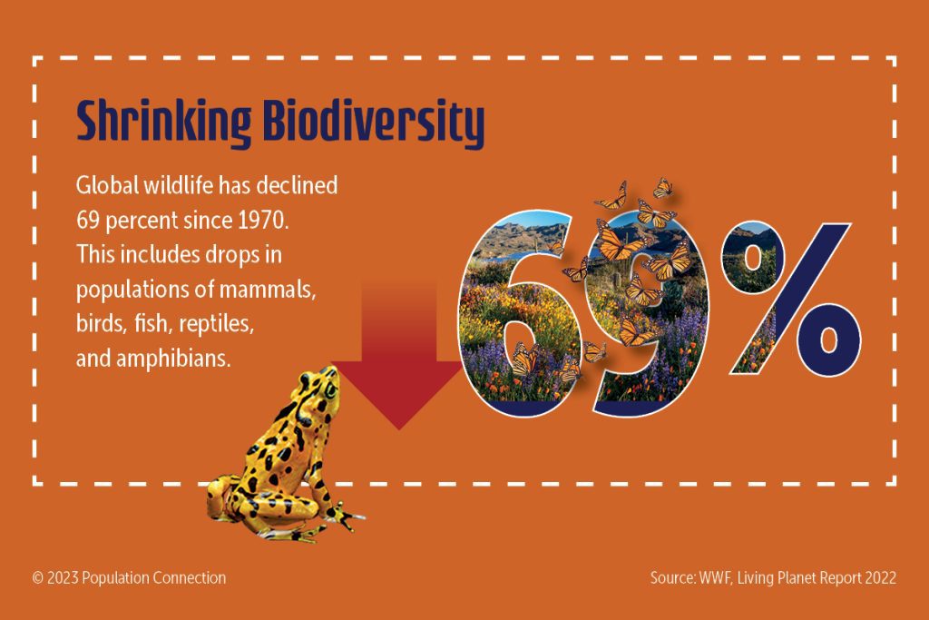
Since 1970, global wildlife has declined 69%. This includes drops in mammal, bird, fish, reptile, and amphibian populations. Biodiversity data... Read more »
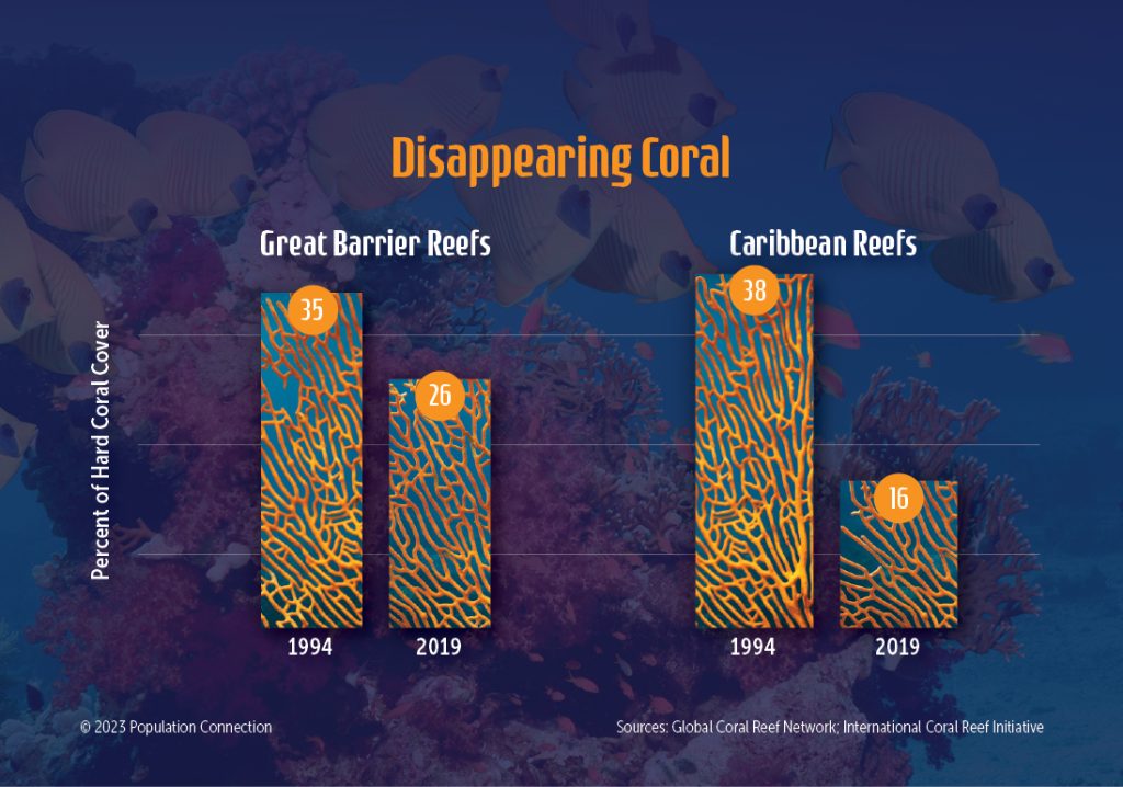
Comparison graphs of two coral reefs' shrinking size over recent 25 year period.
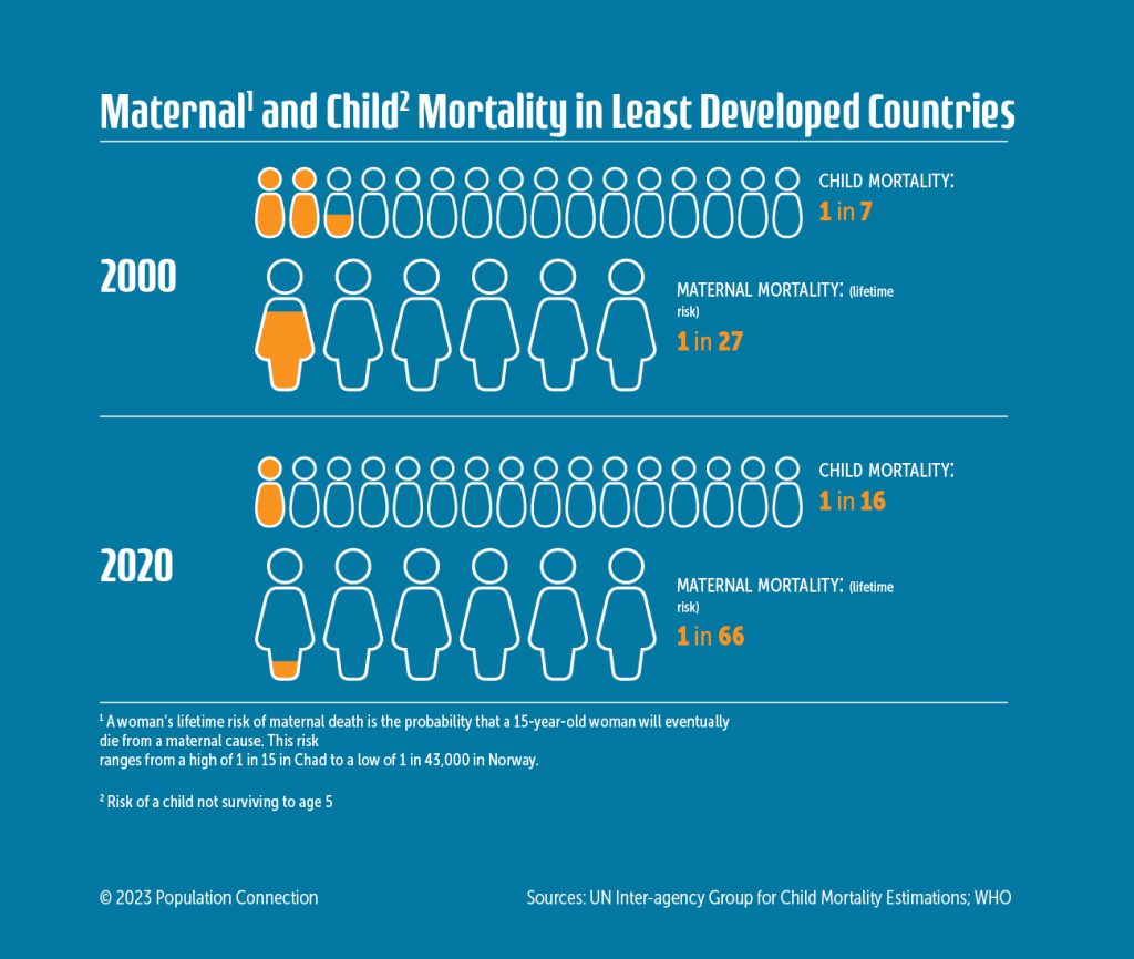
Compares 2000 and 2020 statistics on maternal and child mortality in LDCs.
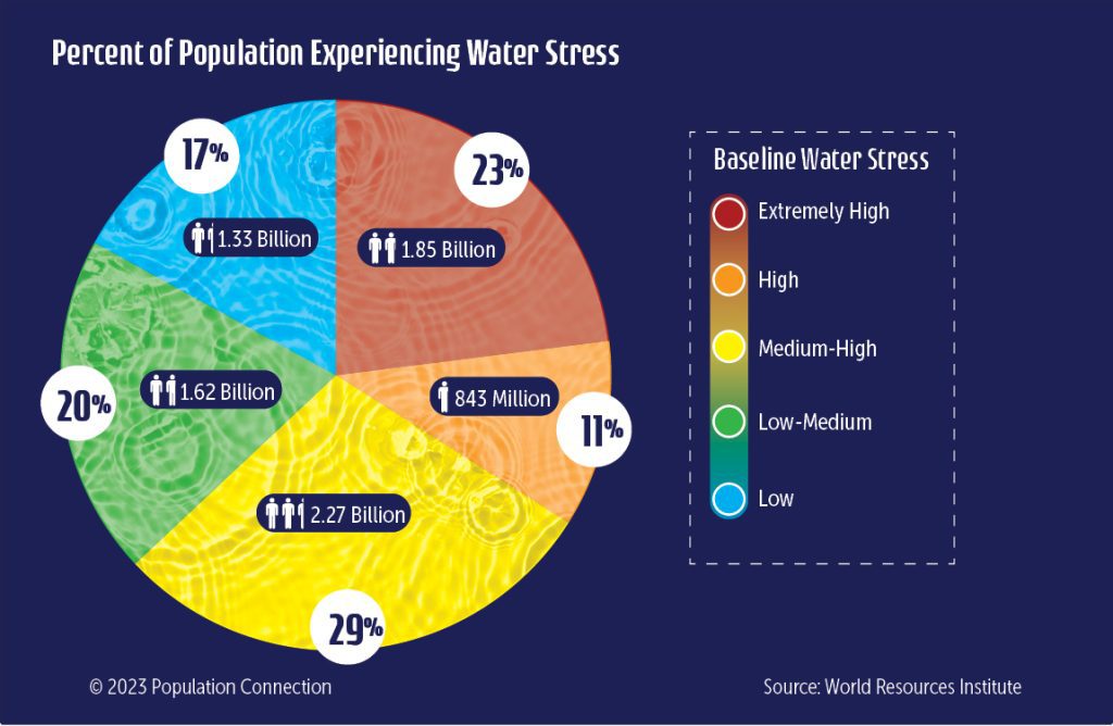
Percentage of people living with various levels of water stress.
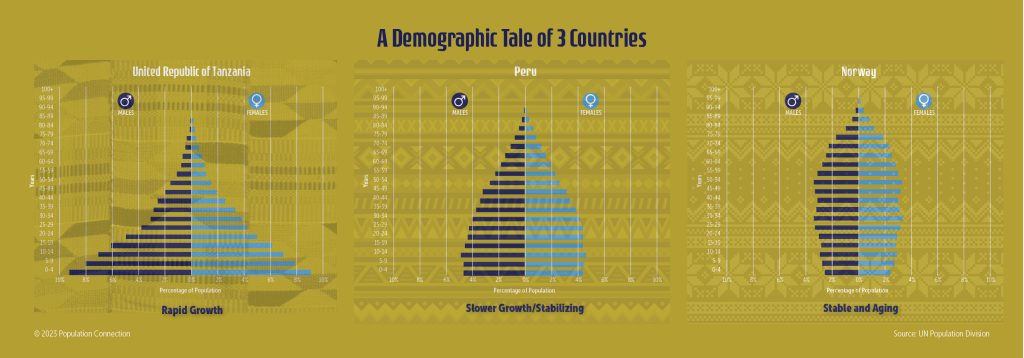
Three age structure pyramids compare different population pyramid shapes and growth rates.
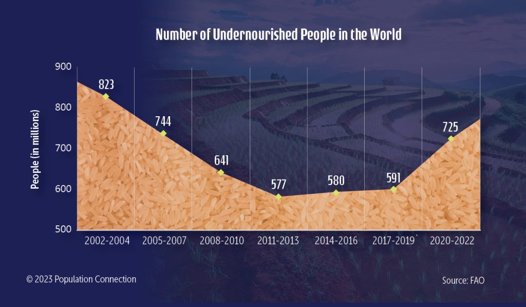
Line graph shows the number of undernourished people in the world from 2002 to 2022.
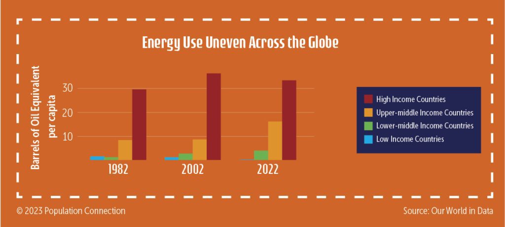
Comparison of energy use per capita over time based on wealth.
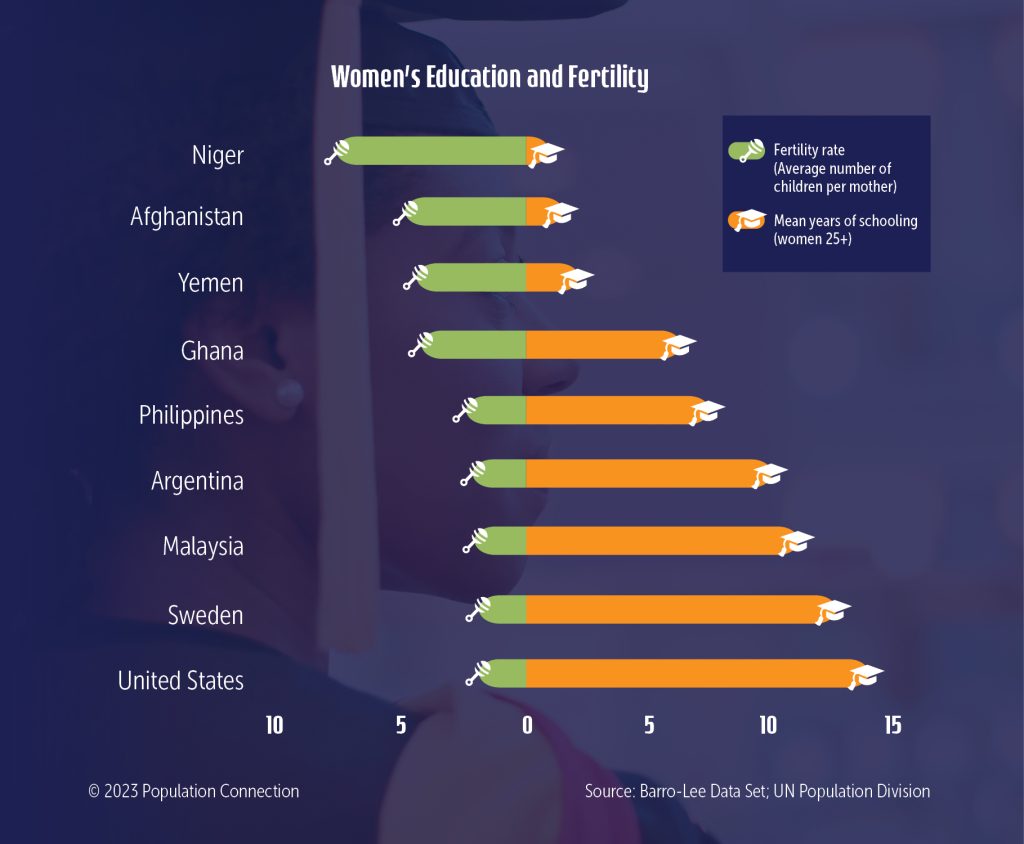
Graph displays the fertility rate and mean years of schooling for nine countries.
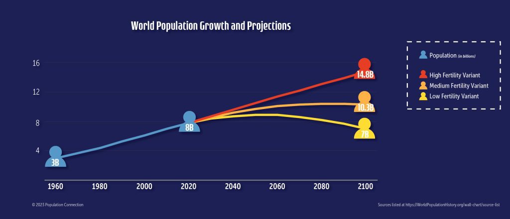
Display of the UN's population projections to 2100 including the high, medium, and low fertility variants
United States' demography infographic collection
Data visualizations on demographic trends in the United States today and through history
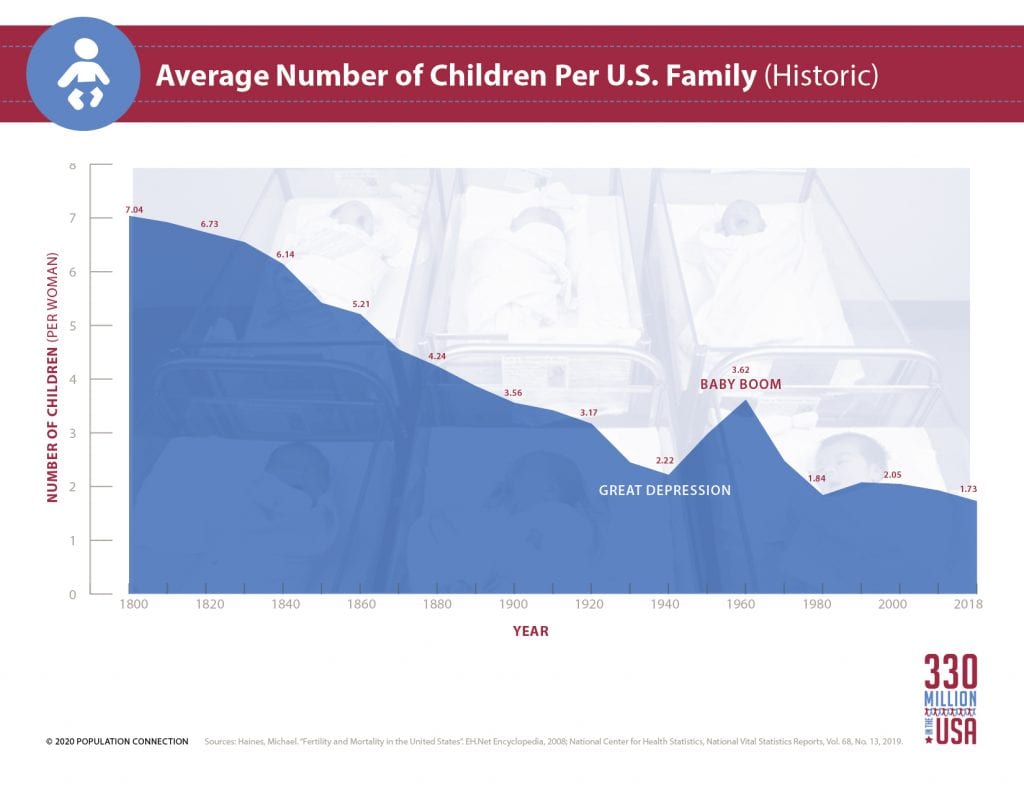
Average number of children per woman in the U.S. from 1800 to 2018.
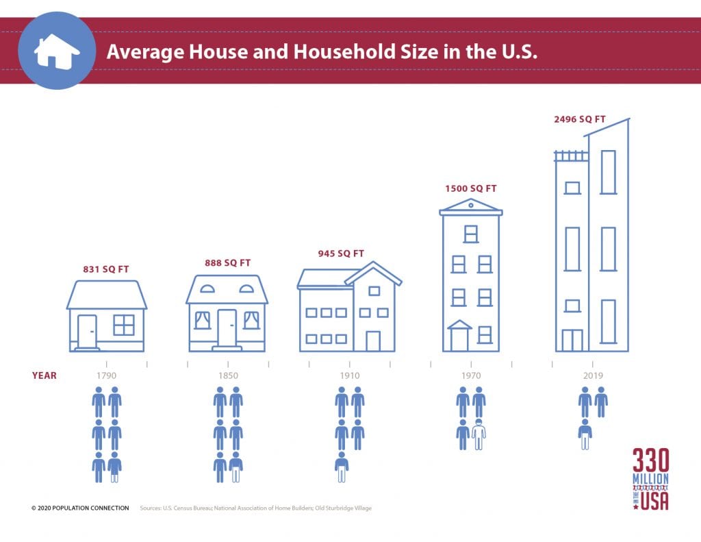
Average number of people per house and average house size in the U.S., 1790-2019.
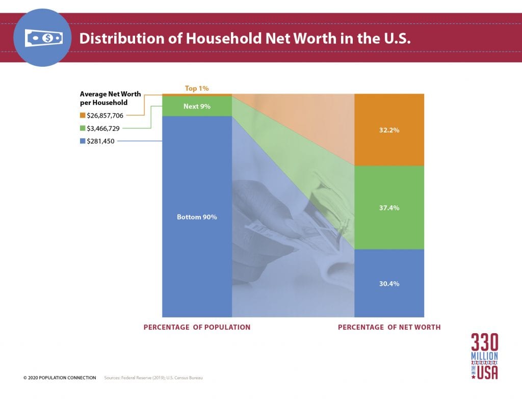
Visual display of household wealth in the U.S. - the top 1% holds 32% of wealth.
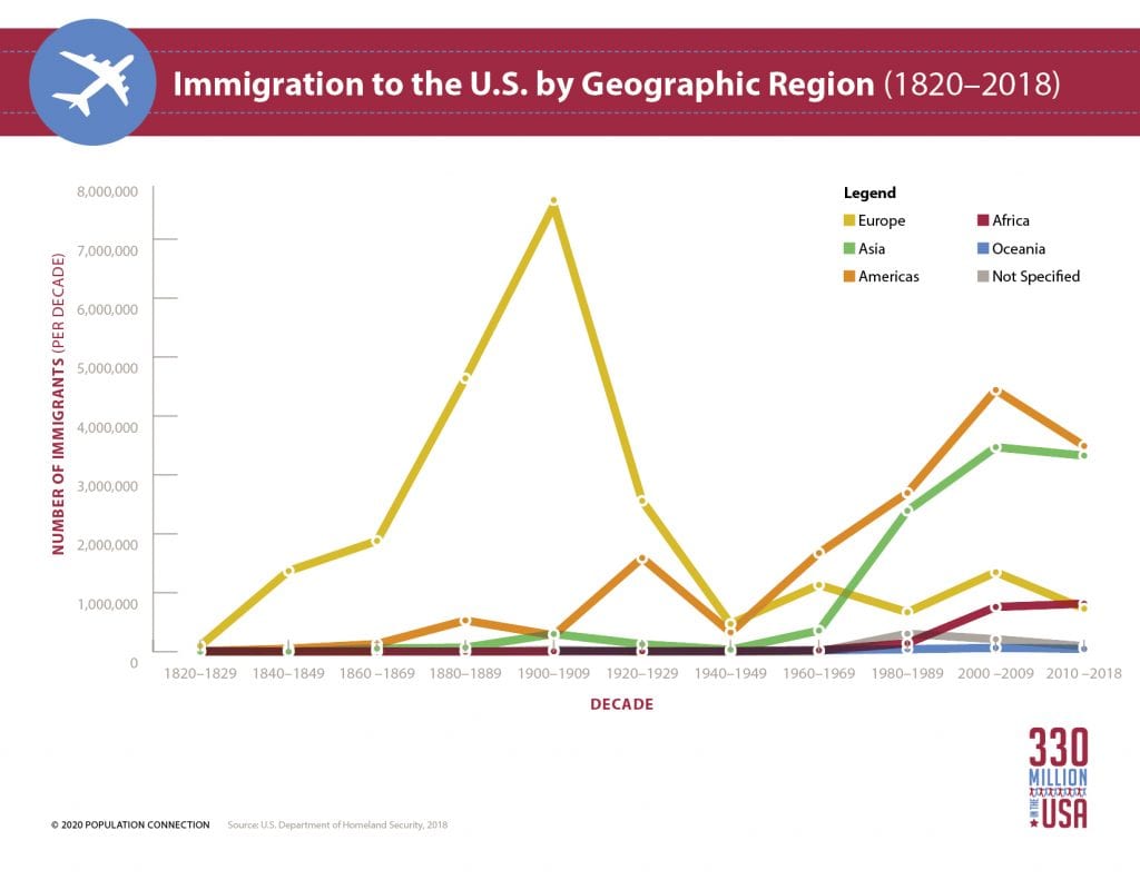
Line graph displays the number of immigrants to the U.S. by home region over time.
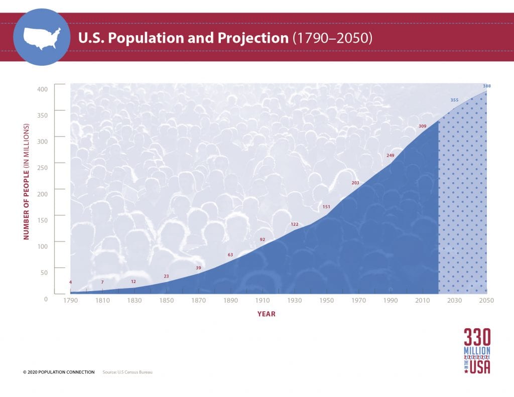
U.S. population from its founding in 1790, to present, and projected U.S. growth through 2050.
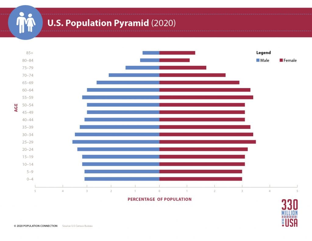
United States' population pyramid, or age structure diagram, for the 2020 population.