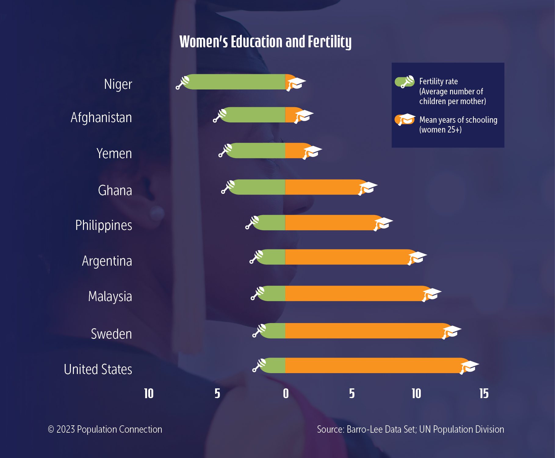
Graph shows connection between fertility and education by comparing nine countries’ fertility rates with their mean years of schooling. The graphic displays the often seen pattern that as schooling increases, fertility decreases.
Schooling data is from the Barro-Lee Educational Attainment Dataset; Population data is from the UN Population Division.
Graphic originally published on the Quick Trip to 8 Billion wall chart.

Other Resources You Might Like:

Through an article, video, simulation game, and small group research, students explore factors that influence women’s fertility decisions in countries... Read more »
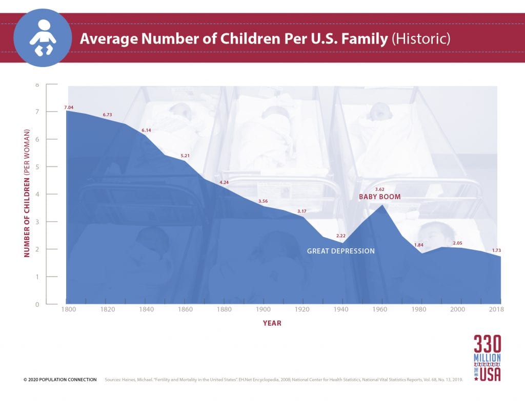
Average number of children per woman in the U.S. from 1800 to 2018.
In this engaging high school activity, students work in small groups to analyze changes in regional fertility rates and life... Read more »
Nice to meet you!
Tell us a bit about yourself so we can continue creating resources that meet your needs.
You’ll only need to fill out this form once. If you’ve already completed the form, you can confirm your email here.