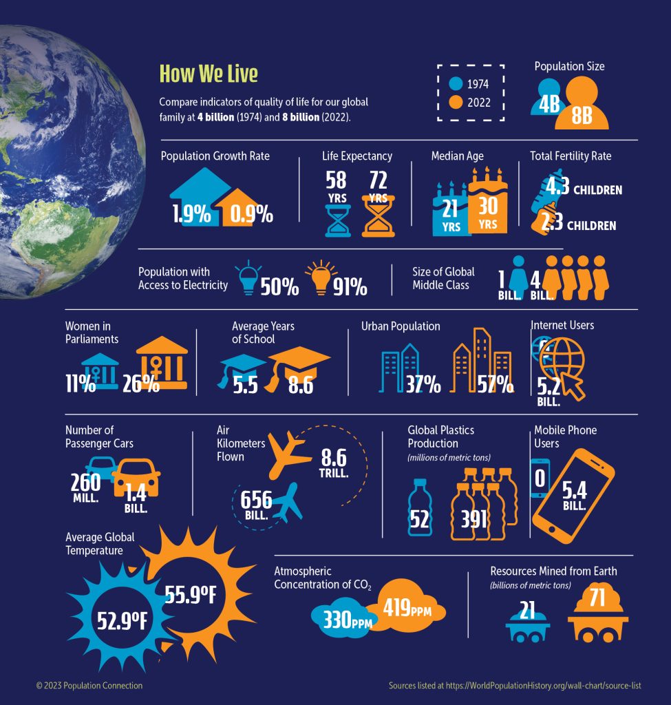
18 graphics compare a wide variety of global indicators between 1974 (when global population was 4 billion) and 2022 (when global population doubled to 8 billion). How have things changed during this 50 year period? Data covers demographics, health and wealth indicators, resource consumption, and more.
Graphic originally published on the Quick Trip to 8 Billion wall chart.
Other Resources You Might Like:
Acting as residents of five major world regions, students compare various statistics that affect people’s health and well-being. Students will... Read more »
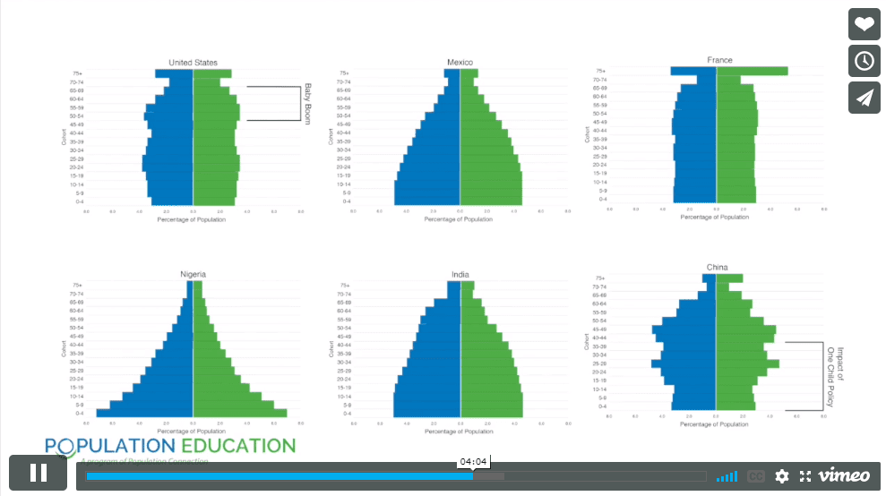
Students construct and interpret population pyramids for six different countries in this lesson. By analyzing age and sex distribution, they... Read more »
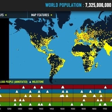
Interactive map of world population growth with annotated population "dots," data overlays, and thematic timelines.
Nice to meet you!
Tell us a bit about yourself so we can continue creating resources that meet your needs.
You’ll only need to fill out this form once. If you’ve already completed the form, you can confirm your email here.