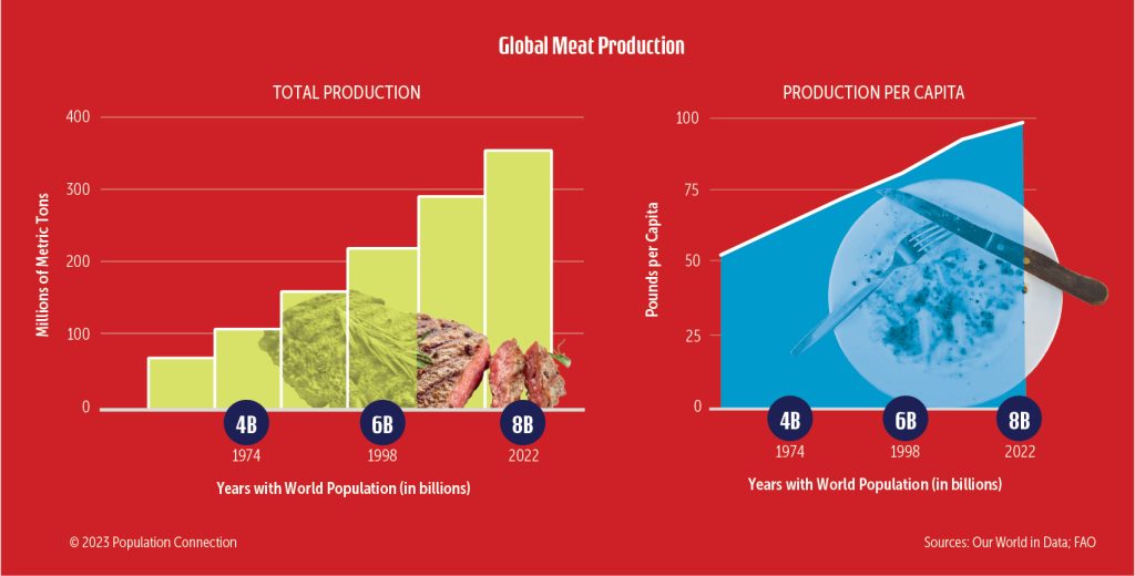
Infographics show the change in global meat production from 1974 to 2022 and the corresponding global population. Bar graph on total global meat production. Line graph on per capita global meat production.
Data is from Our World in Data and the Food and Agriculture Organization (FAO) of the United Nations
Graphic originally published on the Quick Trip to 8 Billion wall chart.
Other Resources You Might Like:

Students use manipulatives to explore the environmental impact of four different types of protein, and the pros and cons of a shifting global diet.

In a simulation, students model what happens to a forest when trees are cut faster than they are planted, and... Read more »
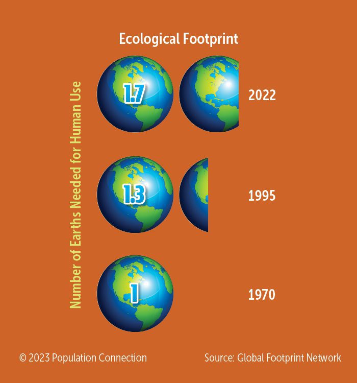
Earth graphics display human's growing global footprint from 1970 to 1995 to 2022.
Nice to meet you!
Tell us a bit about yourself so we can continue creating resources that meet your needs.
You’ll only need to fill out this form once. If you’ve already completed the form, you can confirm your email here.