


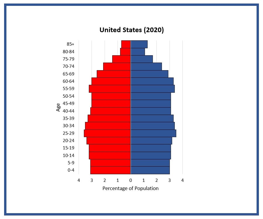
Image of the Unites States’ population pyramid, or age structure diagram, for the 2025 population. The shape of the U.S. population pyramid shows a fairly stable population, with obvious “bumps” for the Baby Boom generation and the generation of the “echo boom.”
Data is from the U.S. Census Bureau.
Graphic produced as part of the 330+ Million in the USA lesson packet.


Other Resources You Might Like:
Students construct and interpret population pyramids for the U.S. at 1880, 1920, 1960, 2000, 2025, and 2050.

History of love and marriage in the U.S. including contraception, sex education, and family size.
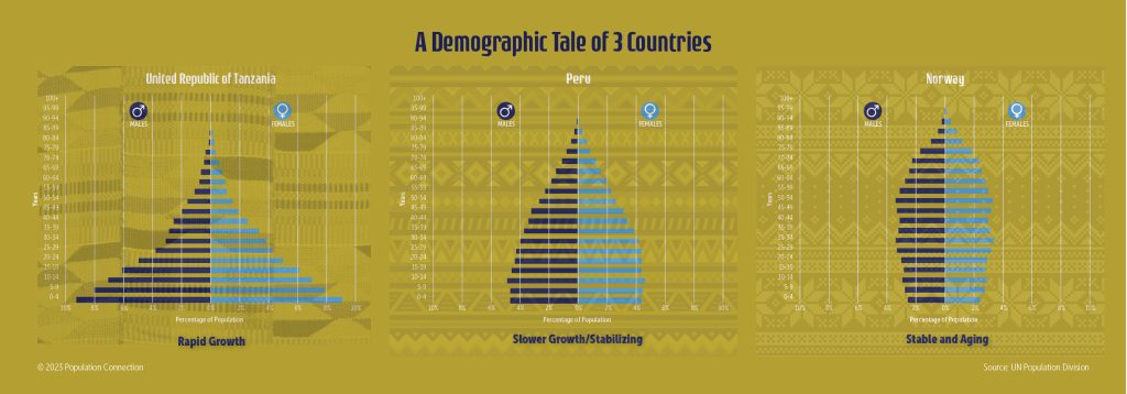
Three age structure pyramids compare different population pyramid shapes and growth rates.
Nice to meet you!
Tell us a bit about yourself so we can continue creating resources that meet your needs.
You’ll only need to fill out this form once. If you’ve already completed the form, you can confirm your email here.