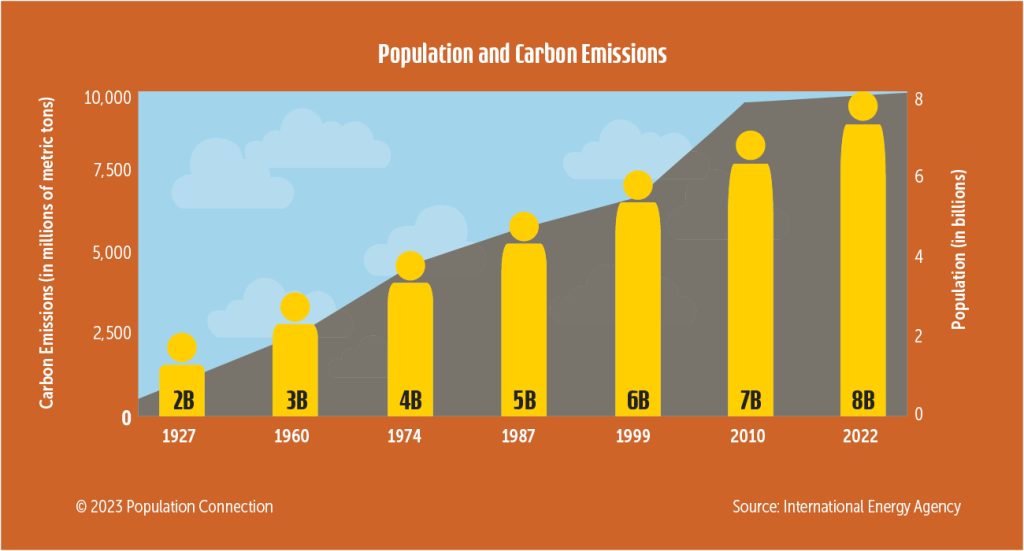
Bar graph shows change in global population from 2 billion people in 1927 to 8 billion people in 2022. Line graph shows change in carbon emissions for the same time period.
Emissions data is from the International Energy Agency; Population data is from the Population Reference Bureau.
Graphic originally published on the Quick Trip to 8 Billion wall chart.
Other Resources You Might Like:
In this engaging climate change lesson, students collaborate in small groups to explore key environmental issues throughout different historical periods.... Read more »
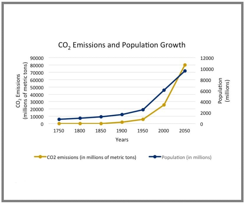
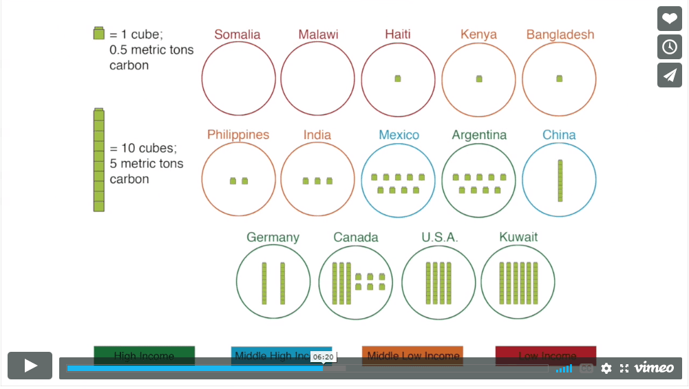
Students graph current carbon dioxide emissions and population growth over time and discuss trends they observe.
Climate change background reading: An overview of how human activities have increased greenhouse gas emissions, the many impacts of a... Read more »
Nice to meet you!
Tell us a bit about yourself so we can continue creating resources that meet your needs.
You’ll only need to fill out this form once. If you’ve already completed the form, you can confirm your email here.