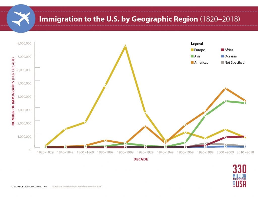
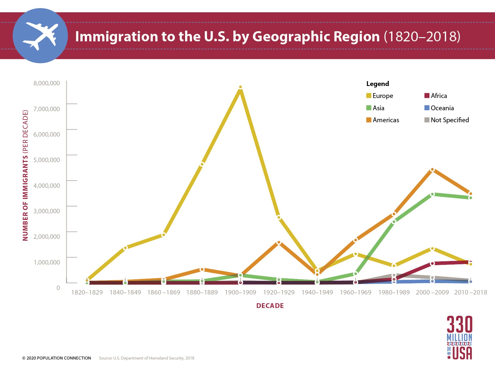
Line graph displays the number of immigrants to the U.S. by home region over time. Between the 1820s and 1940s, most immigrants to the United States were arriving from Europe. In more recent years, people from Asia and other countries within the Americas make up the largest number of immigrants.
Data from the U.S. Department of Homeland Security, 2018.
Graphic produced as part of the 330 Million in the USA lesson packet.
Other Resources You Might Like:

Students listen to immigrant interviews and analyze a text about immigration history in the U.S.

In small groups, students take on the role of real-world migrants and take turns in the “hot seat” to answer... Read more »

Students participate in a “push/pull” simulation to identify reasons people migrate from one place to another and analyze the similarities... Read more »
Nice to meet you!
Tell us a bit about yourself so we can continue creating resources that meet your needs.
You’ll only need to fill out this form once. If you’ve already completed the form, you can confirm your email here.