You might know the three basic shapes of age structures (popularly referred to as population pyramids) and what they mean. But let’s review:
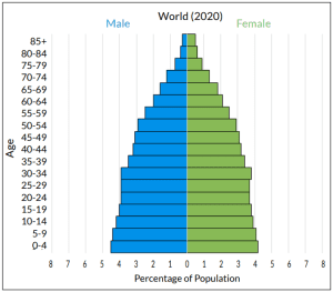
- An actual “pyramid” shape age structure – a graph with a wide base and narrow top – is said to be expanding. This triangular shape reflects a growing, or expanding, population.
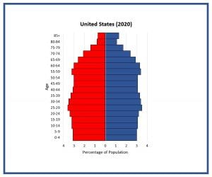
- A rectangular shape age structure – mostly similar width from bottom to top of the graph – is stable. The somewhat vertical sides of the graph show a population that is not changing significantly in size.
- An inverted “pyramid” or triangle shape age structure – a graph with a somewhat narrow base and wider top – is referred to as diminishing, representing a population decreasing in size.
Why Do These Age Structure Shapes Represent Population Change?
Why does a triangular age structure diagram reflect population growth? And what about a rectangular graph means a population is stable? Here is where we need to look at categories of female reproduction. We focus on the fertility of women, because they are the ones who carry and give birth to new little humans (though we all know they can’t do it on their own!).
It is commonly accepted that a woman’s years of reproduction fall into the following three categories:
Pre-Reproductive: Birth to age 14 years – These are ages when most girls are pre-pubescent and unlikely to have the ability to bear children. But their fertile years are still in the future, they just haven’t gotten there yet.
Reproductive: Age 15 years to age 44 years – These are commonly referred to as the child-bearing years. It’s the ages when females are most fertile and most likely to bear children.
Post-Reproductive: Age 45 years to end of life – These are the years during which females’ fertility declines and bearing children again becomes unlikely. Their fertility will not increase again in the future.
*It is important to note that the age divisions between reproductive groupings are not hardline rules. Girls 14 years old and younger, and women over the age of 45, can and do bear children. And some women between the ages of 15 and 44 years old are not able to bear children. These groupings are based on averages of the ages at which most females are at the height of their fertility.
What Do Reproductive Years Have to do with Age Structure Diagrams?
Let’s looks at some real-world data and explore. The age structure diagrams below have been color coded to show the three reproductive categories.
Example of an age structure with an expanding population
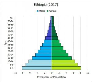 Population growth occurs when the segment of the population currently in its childbearing years has produced a generation larger than itself. A triangular shaped graph like Ethiopia’s has a wide base that is in fact larger (meaning wider) than the generation that produced it. In Ethiopia, people aged 0-14 (pre-reproductive years) make up 43% of the population; people aged 15-29 (lower reproductive years) make up 28% of the population; and people aged 30-44 (upper reproductive years) make up 16% of the population. Additionally, as the children in the pre-reproductive grouping grow up, enter their reproductive years, and start having children of their own, there is even more potential for future population growth.
Example of an age structure with a diminishing population
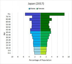 Japan’s age-sex structure tells a different story. Over 50 percent of people (53.5% to be exact) are in their post-reproductive years. And what’s even more telling is that the bars representing people in their pre-reproductive years are smaller (narrower) than those of people in their reproductive years. People aged 30-44 (upper reproductive years) make up 19% of the population; people aged 15-29 (lower reproductive years) make up 15% of the population; and people aged 0-14 (pre-reproductive years) make up just 13% of the population. The generations in their reproductive years have produced a generation smaller than themselves and the population will shrink. The inverted triangle shape shows all of this with its wide top and much narrower base.
Example of an age structure with a stable population
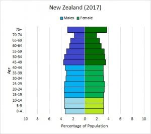 A country whose population is predominantly equal across reproductive categories has a more stable population, like New Zealand. The bars representing young people who are in the pre-reproductive category is very similar in size to the bars of those currently in their reproductive years; those who are reproducing have produced a generation of roughly the same size. In New Zealand, people aged 0-14 (pre-reproductive years) make up 20% of the population; people aged 15-29 (lower reproductive years) also make up 20% of the population; and people aged 30-44 (upper reproductive years) make up 19% of the population. Each generation is replacing itself, if you will, so the population size doesn’t change significantly.