Making a population pyramid, or age-sex distribution graph, in Excel has never been easier than with this step-by-step guide that takes you all the way from gathering the needed demographic data to the finished product – a graphically-accurate (and beautiful!) population pyramid.
A few notes before we begin:
- This guide is based on using Microsoft Excel 2016.
- Where I say “click” you might need to double click.
- Don’t forget to save throughout.
Let’s get started!
I. Get the Population Data for your Country
1. Go to the U.S. Census Bureau’s International Database.
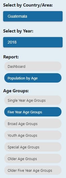
2. In the column on the left, select the country of your choice under ‘Select by Country/Area.’ I chose Guatemala for this example.
3. Under ‘Report’ click ‘Population by Age’ and then choose ‘Five Year Age Groups.’
4. This is what the selection column looks like:
5. The generated report will look like this:
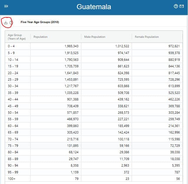
6. In the upper left you’ll see a download icon (circled in red above). Click the icon and select Excel as your Download Format. The data will be entered into a new excel document.
7. Save this excel document. It will be the file where you’ll build your population pyramid.
II. Organize and Clean your Population Data
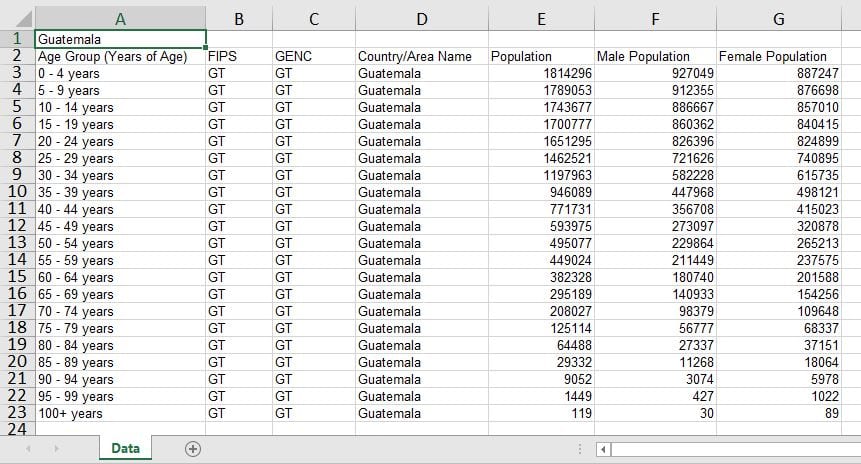
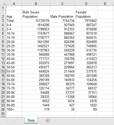
1. Rename the excel tab Data. (Rename by right clicking on ‘Sheet1’ and selecting Rename so the text ‘Sheet1’ is highlighted. Type in new name.) Add a new row 1 above the headings and in cell A1 write the country name.
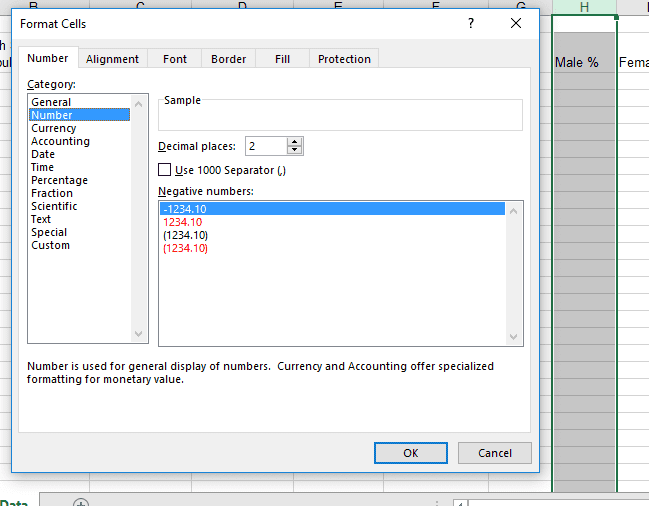
2. Delete the word ‘years’ from all of the age range cells in column A (cells A3 through A23). For the cells with ages ‘5-9′ and ’10-14’, you may need to change the cell category to Text. To do this: Highlight cells A4 and A5, right click, and select Format Cells. In the ‘Number’ tab, select ‘Text’ from the list on the left and click OK. You may need to re-type the ages 5-9 and 10-14.
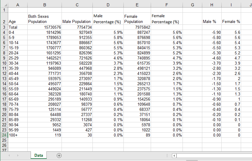
3. Delete columns B, C, and D. You’ll be left with four columns: Age Group; Both Sexes Population; Male Population; Female Population.
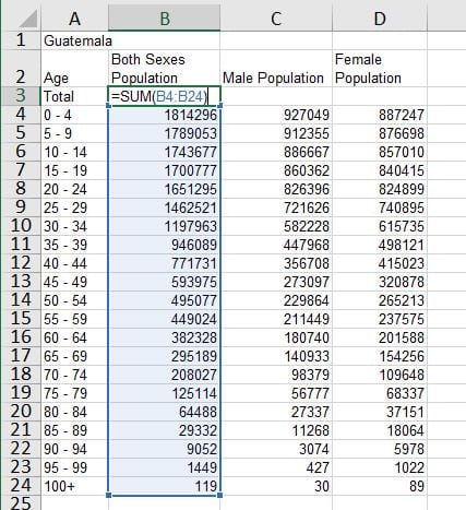
4. Insert a new row under the headings that will become row 3 and include the Total for each population group. Write ‘Total’ in cell A3.
5. Calculate the total for all three population groups.
- To calculate the total for Both Sexes, select cell B3 and type the following equation: =SUM(B4:B24) Hit enter on your keyboard.
- To calculate the total for the Male Population, select cell C3 and type the equation: =SUM(C4:C24) Hit enter on your keyboard.
- To calculate the total for the Female Population, select cell D3 and type the equation: =SUM(D4:D24) Hit enter on your keyboard.
6. Insert a new column between Male Population and Female Population and label it ‘Male Percentage (%).’ Label the column to the right of Female Population column as ‘Female Percentage (%).’
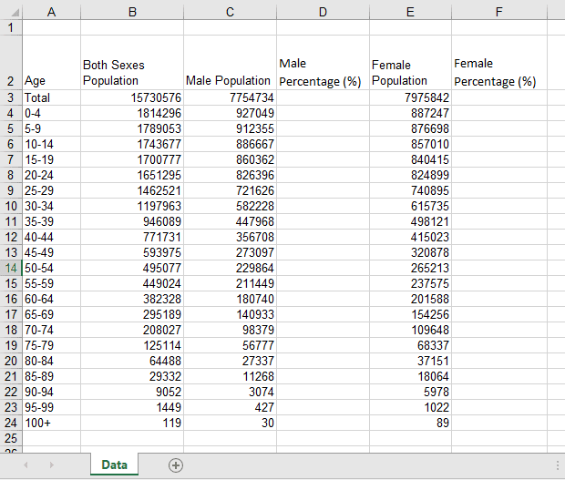
7. For both of these new columns, format the cells to represent data as a percentage.
i. Highlight column D, right click, and select Format Cells.
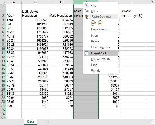
ii. Under the Number tab, select ‘Percentage’ and change the Decimal Places to 1.
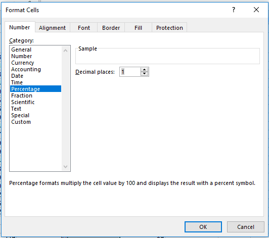
iii. Repeat for Column F.
8. For each age/sex cohort, set up an equation to calculate the what percentage of the total population it represents.
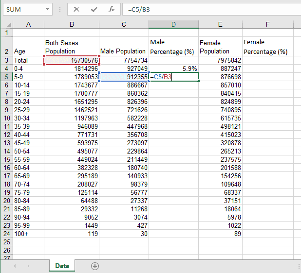
i. We’ll start with finding the percentage of Males ages 0-4 (so we’re filling in cell D4).
ii. Click on cell D4 and enter the equation =C4/B3 and hit Enter. What you’ve done, is divided the males ages O-4 (cell C4) by the total population (cell B3).

Note: After you’ve entered the equation, you must hit enter for the calculation to happen. You cannot simply click outside the cell.
iii. For every new age/sex cohort, you need to enter the appropriate data as the numerator, but always the total population of both sexes as the denominator. So for Males ages 5-9, the equation is: =C5/B3. Enter.
iv. Repeat this process for every Male age cohort: cells D4 through D24. Then do the same for the Female age cohorts starting with females ages 0-4 in cell F4. Enter the equation: =E4/B3. Enter.
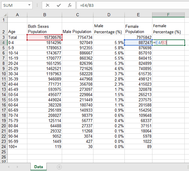
v. Repeat this process for every Female age cohort: cells F4 through F24.
vi. Be careful of copying and pasting the equation that the denominator does not change, but always remains B3 (the total population of both sexes).
9. In a new column, retype the Male Percentage data as numbers. What this means is:
i. Label column H as ‘Male %’
ii. Highlight the column, right click and select Format Cells. Under the Number tab, change the Category selection to ‘Number.’ In the ‘Decimal places’ field, enter 2. Click OK.
iii. Manually type (do not copy and paste) the number from column D “Male Percentage (%) into the corresponding rows in Column H.
iv. Make the numbers in the Male % column negative. (Ex: 5.9% in column D would become -5.90 in column H.) To do this, add the negative symbol in front of the number and click Enter. You cannot simply click outside of the cell, you must hit Enter.
10. In column I, retype the Female Percentage data as numbers using the same steps that you used for the Male Percentage. But do NOT make the numbers negative.
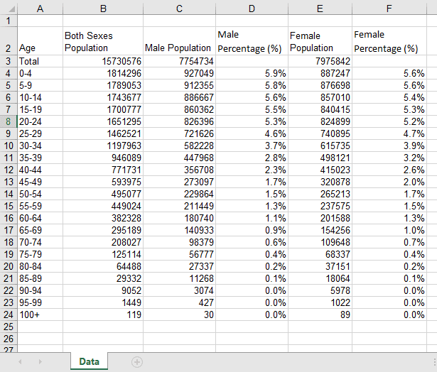
Now your data is ready! (Don’t forget to save your hard work!)
III. Create your Population Pyramid
1. Add a second sheet (by clicking on the + symbol on the lower tab bar) and rename it Country Pyramid. This is where you will actually build your population pyramid.
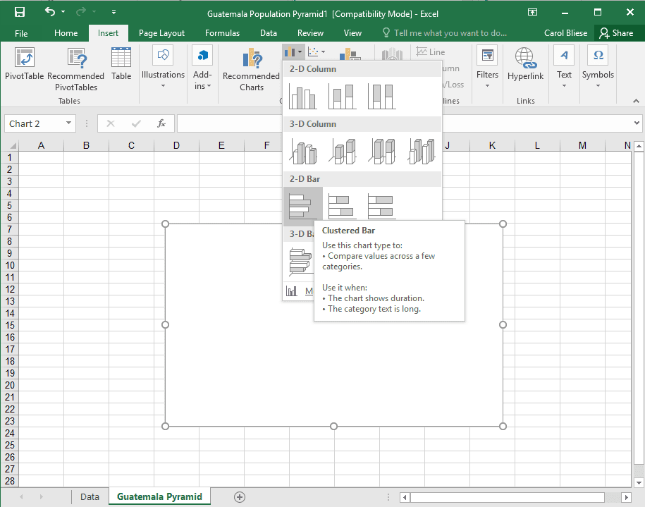
2. Click Insert on the main toolbar. In the Chart area, click on the Column/Bar Chart dropdown and select Clustered Bar under the heading 2-D Bar.
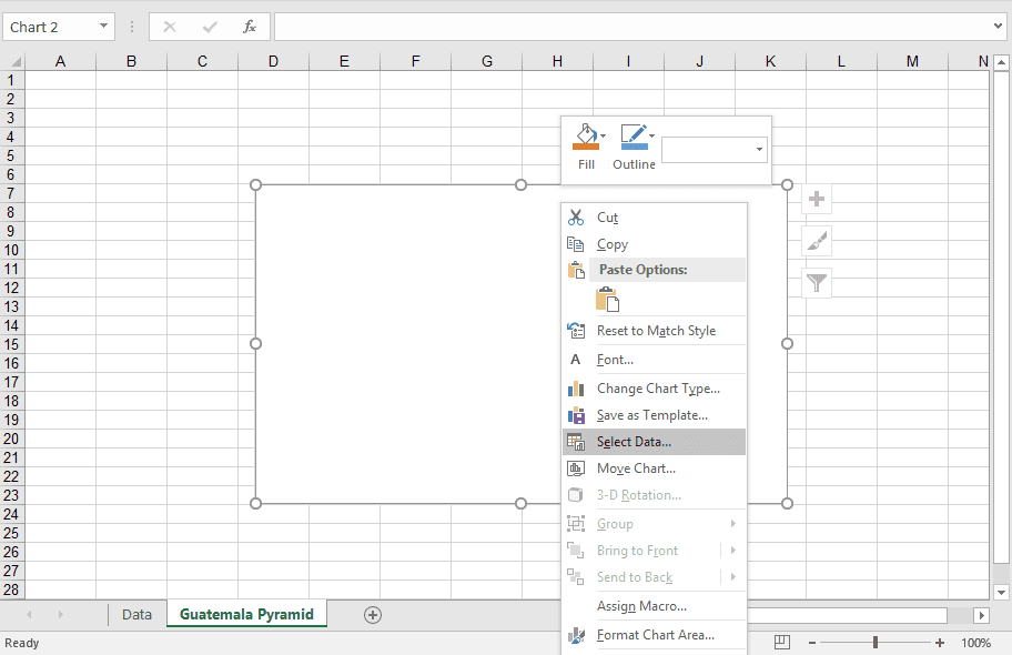
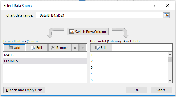
3. Right click in the chart area and click on ‘Select Data.’
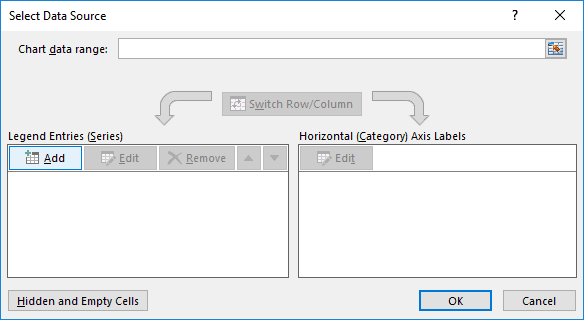
4. In the Select Data Source pop-up box, click on Add.
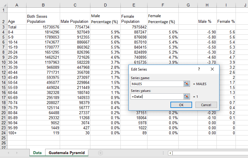
5. In the Edit Series pop-up box, fill in the Series name with MALES. And in the Series values field, delete all text so the field is empty.

6. With your cursor still in the Series values field, click on the lower tab for Data to return to your data fields.
7. Highlight the data in the Male % column (H4 through H24).

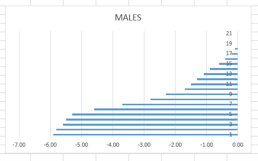
8. Click OK in the Edit Series pop-up box. The graph should look like this:
9. Now back in the Select Data Source pop-up box, repeat the process for Females by:
i. Clicking Add.
ii. Write FEMALES in the Series name field.
iii. Delete the text out of the Series value field.
iv. While the cursor is still in the Series value field, go into the Data sheet and select the cells of female data (I4 though I24).
v. Click OK in the Edit Series pop-up box.
The Select Data Source should now look like this.
10. Click on the Edit button under Horizontal (Category) Axis Labels so the Axis Labels pop-up box appears.
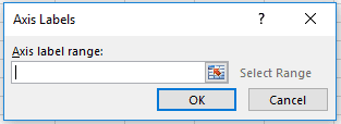
11. Click inside the empty field and while your cursor is there, go into the Data sheet and select the cells of Years (A4 through A24).
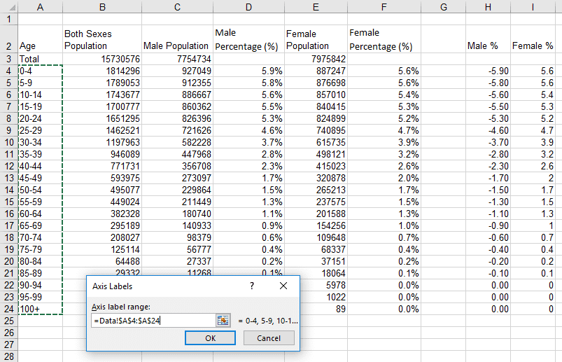
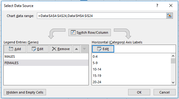
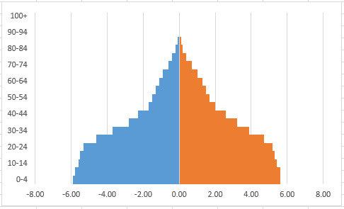
12. Click OK in the Axis Labels box. The Select Data Series pop-up box should look like this. Click OK.
And your graph should look like this:
13. Double click on the center axis line (between the blue and orange bars) to bring up the Format Axis control column.
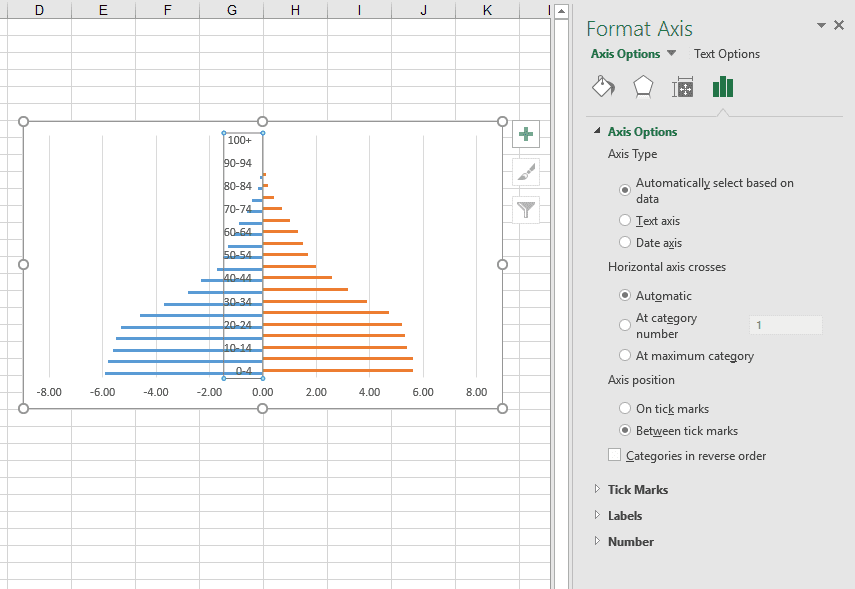
14. Click on Labels and change the Label Position to ‘Low.’

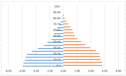
This will move the y-axis labels from the center of the graph to the left side. And your graph should look like this:
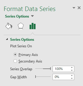
15. Double click on any one of the data bars on the graph (blue or orange) to bring up the Format Data Series control column. Click on the Series Options icon to the far right.
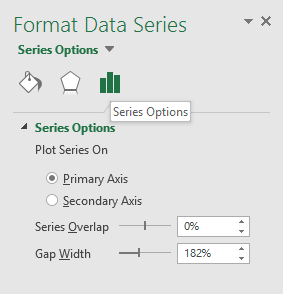
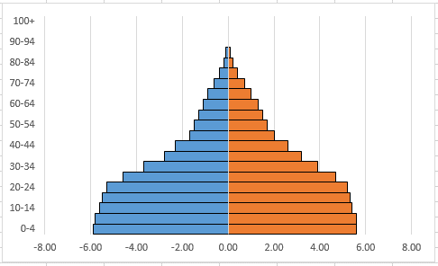
16. Change the Series Overlap to 100% and the Gap Width to 0%.
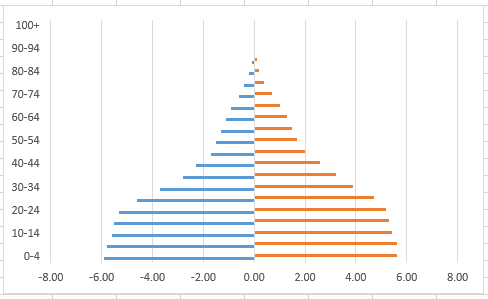
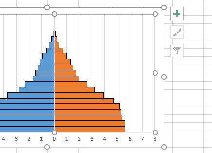
And now your graph should look like this:
17. While still in the Format Data Series control column, click on the Fill & Line icon and change to Border to ‘Solid Line.’ Also change the Color to black to add an outline to one half of your graph.
18. Double click on the other side of your graph that doesn’t have the outline, change the Border to ‘Solid Line’ and the Color to black.
Now your graph should look like this:
19. Click on any number in the x-axis to bring up the Format Axis control column. Click on the far right icon for Axis Options.
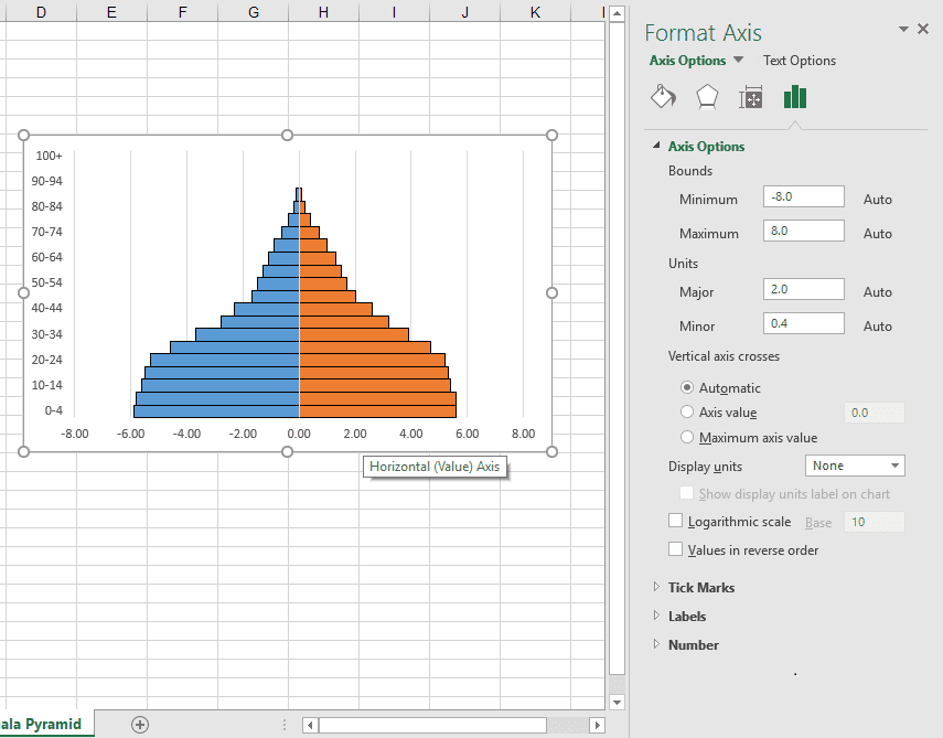
20. Make the following adjustments:
i. Bounds – This is the maximum number your x-axis will go up to. The default is -8.0/8.0 which works fine for Guatemala. If you’re graphing a country with cohorts that are larger than 8%, increase the Minimum to -10.0 and the Maximum to 10.0.
ii. Units – Change the Major to 1.0
iii. Vertical axis crosses – select Axis value and leave as 0.0
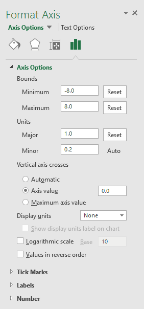
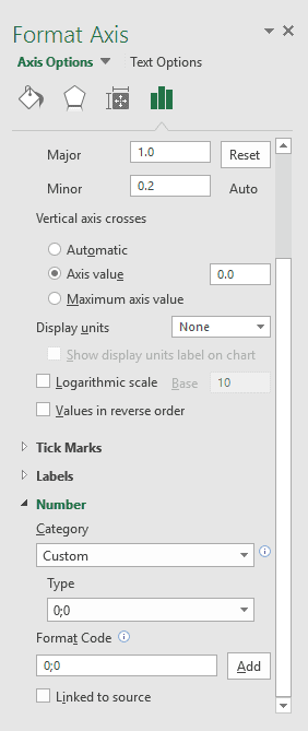
21. Still in the Format Axis control column and in the Axis Options section, now click on Number and make the following adjustments:
i. Category: Custom
ii. Type: 0;0
iii. Format Code: 0;0
iv. Click Add
Now your graph should look like this:

22. Add a title to you pyramid and labels for the x- and y-axis. To do this:
i. Click anywhere within the chart area to bring up three control buttons to the upper right of the graph. They look like this:
ii. Click on the + to open a list of Chart Elements.
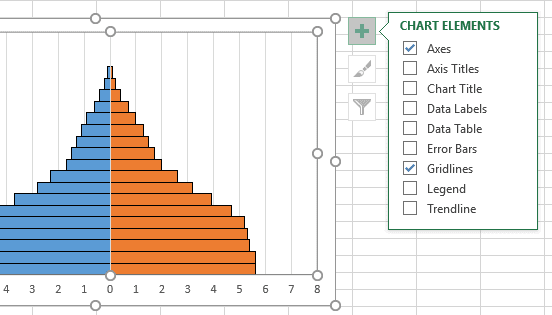
iii. Check the box for Axis Title and the text “Axis Title” will appear as labels for the x- and y-axis. Double click on each of those to highlight and relabel.
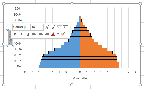
iv. Label the x-axis Percentage of Population. Label the y-axis Years.
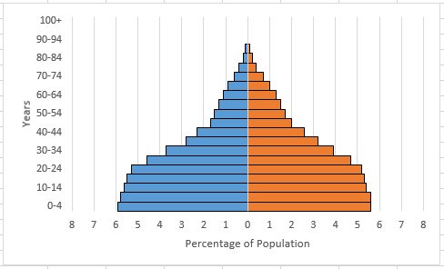
Your graph should look like this:
23. Give your graph a title.
i. Click anywhere within the chart area to bring up the three control buttons. Click on the top + button, and check the box for Chart Title so the text “Chart Title” appears at the top of your graph.
ii. Double click on “Chart Title” to highlight and retitle.
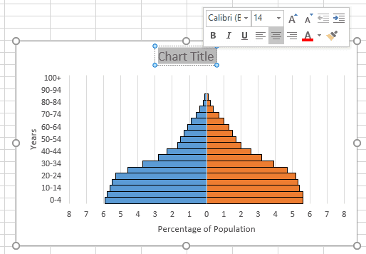
iii. Type in the name of the country and the data’s year.
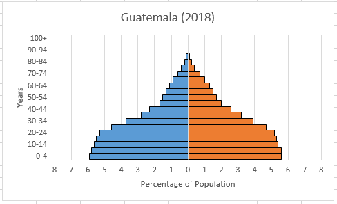
24. If you’d like to change the colors of your graph, double click on either side to pull up the Format Data Series control column. Click on the far left icon for Fill & Border. Click on Fill and choose a new color option. Then double click on the other side of your graph to change the color on that side.
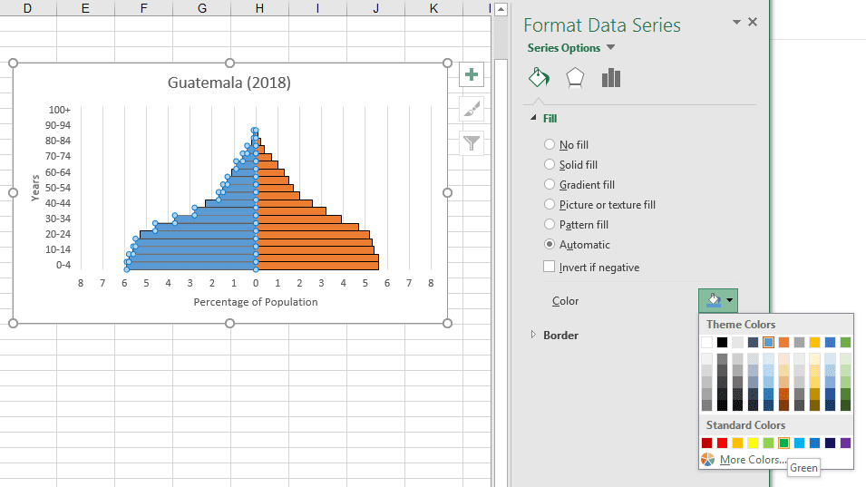
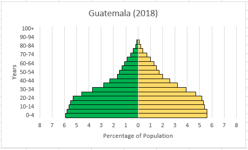
And now your population pyramid has its own custom colors. Here is what the age-sex graph looks like for Guatemala:
I hope you found this instructional guide to building a population pyramid useful!