When you look at a population pyramid for the U.S. today, you’ll see a fairly straightforward “stationary population” shape. This means that the U.S. age structure looks somewhat rectangular with fairly vertical sides, representing generations replacing themselves, and a population size that is mostly stable.
But this hasn’t always been the case. As for 2024, the USA is 248 years old, having been founded in 1776. This long history has shaped the nation’s demographic trends. There has been a dramatic change in the age and sex make-up of the U.S. population, and there’s no better way to see this change than through the nation’s changing population pyramid.
In this blog we’ll take a deep-dive into the last 150 years of U.S. demographic history. How and why did the U.S. population pyramid change so much over the past 150 years? Read on to find out.
Changing Shape: U.S. Population Goes From Expanding to Stable
In 1880, the United States population pyramid had a triangular shape. A triangle-shaped age structure diagram is typical for a population that is expanding in size. It’s the same shape that we see for current pyramids of developing countries in our modern world. Countries that have a triangular population pyramid today include Ethiopia, Guatemala, and Nigeria, just to name a few.
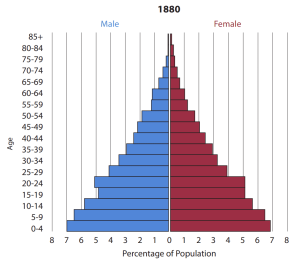
It makes sense that the age-sex distribution of the U.S. in 1880 was similar to developing countries today, because the U.S. was developing at that time. And as is the case with many developing nations, the United States had a very young population. The average family size was large (4.24 children/family – over twice what it is today) and life expectancy was relatively low (39 years – more than half of what it is today).
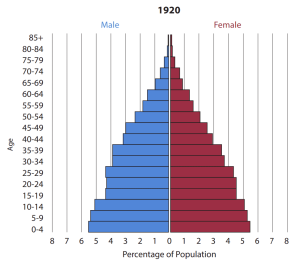
As the U.S. moved through a demographic transition, with declining fertility rates, its population pyramid changed as well. Forty years later, in 1920, the U.S. population pyramid, while still a triangle, had a noticeably narrower base, illustrating fewer young people in the population.
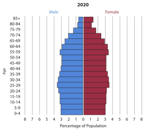
And 100 years after that, in 2020, the U.S. population pyramid had become fairly balanced between young generations and older generations, creating a much more rectangular pyramid shape. Rectangular-shaped pyramids are typical for a population that has a fairly stable population size. At this point, it was a country with a low fertility rate (making for a narrower base than previous pyramids) and high life expectancy (making for a wider top than previous pyramids).
Changing Ratio of Males to Females Through U.S. History
In addition to indicating growth, stability, or shrinking in size, population pyramids also portray the balance of males to females in a population. What does this balance, or imbalance, in males to females of different ages tell us about different eras of U.S. history?
Let’s return to the U.S. population pyramid in 1880. The age cohorts for males and females ages 20-24 are the same; both represent 5.1 percent of the population at that time. But in the next row up the graph, the cohort for males ages 25-29 is 4.2 percent while the cohort for females ages 25-29 is only 3.9 percent? Why the sudden 0.3 percent difference in sex ratio? Much of the discrepancy is attributed to child birth. Until the mid-1930s, the maternal mortality rate in the U.S. was quite high. In the late 19th century maternal deaths due to bacterial infections were common and the population saw 900 maternal deaths per 100,000 live births. Today, that number is closer to 17 deaths per 100,000 live births thanks to antibiotics, pre-natal care for mothers and babies, safer obstetrical procedures, and more sanitary conditions in delivery rooms.
Throughout U.S. history, the youngest cohort sees more males than females. This is biological – statistically, there are more boys born each year than girls (105 boys for every 100 girls). But this ratio of more males than females doesn’t hold true as you move up the pyramid. Some of the change is the result of life expectancy.
Starting with people born after 1900, a female’s life expectancy began to surpass that of a male. In 2019, the life expectancy at birth in the U.S. was 81 for females and 76 for males. Women’s longer lives are due to a number of genetic and social factors. In general, men are more predisposed to certain health risks than women, although this gap is narrowing. Historically, men have made up the majority of the military and worked in more dangerous and physically taxing industries, increasing their likelihood of an earlier death. In the 2020 U.S. population pyramid, the female cohorts are larger than the male cohorts starting with ages 45-49 and continue to be larger up the graph.
How the Baby Boom Shaped the U.S. Population Pyramid
The Baby Boom following World War II is one of the most well-known demographic events in U.S. history. So it’s not surprising that the baby boom had a dramatic impact on the shape of the U.S. population pyramid at that time.
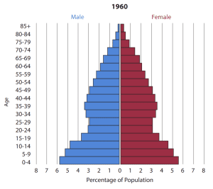
Take a look at the unique shape of the U.S. pyramid in 1960. The wide base represents a large number of children. These are the baby boomers – the children born in the aftermath of WWII when economic growth and soldiers returning home from war boosted fertility rates.
The wide base is even more pronounced in the age diagram because of the constriction of the cohorts for the ages 15-19, 20-24, and 25-29. (It’s important to note that while it might look like there is a bulge at ages 35-39, those cohorts are actually on trend and it’s the constrictions below it, that break the pattern.) People between 15 and 29 years old in 1960 were born during the Great Depression, a time when family sizes shrunk as the result of poverty, hunger, and uncertainty.

As the baby boom generation aged, we see the “bump” in the population pyramid move up the graph, as you see here in the U.S. population pyramid for 2000.
The U.S. Population Pyramid in the Future
In the next 25 years, it is expected that the U.S. population pyramid will become even more rectangular, with the vertical sides of the graph smoothing out even further to display equal-size age cohorts. This is because future projections for the U.S. suggest a balanced population with years of replacement-level, or below replacement-level, fertility.
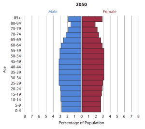
Of course, along with changes to fertility and mortality trends, political, economic, and social events also shape U.S. demographics. It is impossible to know exactly what will happen in the future that may constrict or expand various cohorts.


