Grade Level:
6-8
Teacher Resources
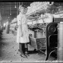
History of U.S. work from agrarian roots through the Industrial Revolution to today's gig economy.
A visual demonstration of the limited sources of food available from the Earth’s land, followed by discussion...
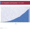
U.S. population from its founding in 1790, to present, and projected U.S. growth through 2050.
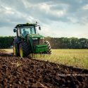
Set of 7 lessons and 1 reading looks at humans’ use of land for food, energy and...
Combining environmental and global studies lessons will inspire middle schoolers with real-world connections.
"Best of" library of readings and lesson plans with interactive methods for all subject areas.
Set of 14 lesson plans and 6 readings on U.S. population history and trends.

Set of 9 lessons and 1 reading covers demographic concepts like birth/death rate, carrying capacity, and density.

Set of 6 lessons and 1 reading link students’ decisions today with short- and long-term outcomes.
PopEd Impact
campuses
"The activities not only bring out important content, but they also provide real-world context for environmental, population and sustainability issues. They engage participants in very thought-provoking and critical-thinking discussions.”
Helen de la Maza, Environmental Educator, Irvine, CA