Population pyramids are used by demographers as a tool for understanding the make-up of a given population, whether a city, country, region, or the world. Learning about, using, and understanding these pyramids is an important part of AP Human Geography and AP Environmental Science. So what is a population pyramid?
A population pyramid is a graph that shows the age-sex distribution of a given population. It a graphic profile of the population’s residents. Sex is shown on the left/right sides, age on the y-axis, and the percentage of population on the x-axis. Each grouping (ex: males aged 0-4) is called a cohort.
It is worth noting that these age-sex structures portray a binary for sex and use a person’s biological sex as assigned at birth, which can be different from a person’s gender identity or current sex. You can read more about Gender, Sex, and Population Pyramids here.
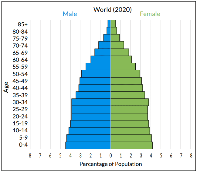
The image here is the population pyramid for the world from 2020 (taken from the PopEd activity Power of the Pyramids).
A population pyramid does not tell you the actual population in numbers. Rather, it displays percentages and shows what portion of people fall into each cohort. Demographers use population pyramids to see population trends in the past, examine the current resident profile, and also to project how the population will increase/decrease in the future.
Three Common Population Pyramid Shapes
The three common shapes of population pyramids indicate if the represented population is growing, stable, or shrinking. The data behind population pyramids gives clues to fertility trends, and therefore indicates how a population will change in size.
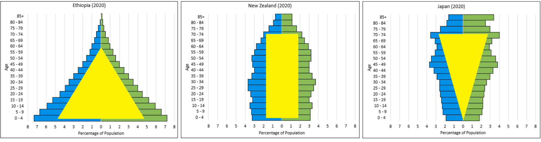
The more triangular a population pyramid, the faster that population is growing; old generations are producing larger new generations. The pyramid shape has a larger bottom than top; a larger percentage of the population are in their reproductive years or haven’t even reached reproductive age. As a result, there is much potential for growth. Stable populations’ pyramids are more rectangular in shape, with current generations being replaced by new generations of approximately the same size. An inverted triangle, or cup shaped, population pyramid represents a population that is decreasing in size. The top of the graph is widest, showing the largest percentage of the population is older and beyond their reproductive years.