Grade Level:
9-12
Teacher Resources
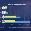
The number of droughts, extreme temperatures, major storms, and floods have increased.
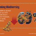
Since 1970, global wildlife has declined 69%. This includes drops in mammal, bird, fish, reptile, and amphibian...
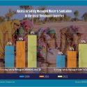
Percentage of people in LDCs with access to safe drinking water and sanitation in 2000, 2010, and...
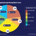
Percentage of people living with various levels of water stress.
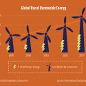
The percentage of global energy use from renewable sources has increased since 1990.
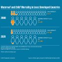
Compares 2000 and 2020 statistics on maternal and child mortality in LDCs.
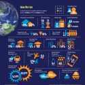
Graphics of 18 demographic, wealth, resource and impact indicators compare 1974 with 2022.
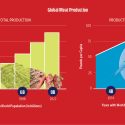
Historic production levels, per capita and total, of global meat products.

PopEd Impact
campuses
"The activities not only bring out important content, but they also provide real-world context for environmental, population and sustainability issues. They engage participants in very thought-provoking and critical-thinking discussions.”
Helen de la Maza, Environmental Educator, Irvine, CA