Grade Level:
9-12
Teacher Resources
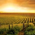
Set of 2 lessons and 3 readings on food availability and access as well as agricultural trends...

Set of 2 lessons and 2 readings on forest land use and protection, in light of increasing...

Set of 3 lessons and 2 readings cover global health issues with real-world data and case studies.

Set of 2 lessons and 2 readings on our consumption choices and the larger implications of consumerism.

Set of 2 lessons and 2 readings cover issues of ocean health and management, including oil spills.

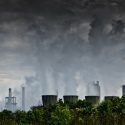
Set of 3 lessons and 2 readings on wide range of energy issues at the local and...
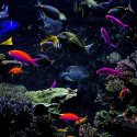
Set of 2 lessons and 2 readings on biodiversity issues, endangered animals, and extinction rates.
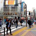
Set of 8 lessons and 3 readings cover demographics, migration, and historic global population growth.
PopEd Impact
campuses
"The activities not only bring out important content, but they also provide real-world context for environmental, population and sustainability issues. They engage participants in very thought-provoking and critical-thinking discussions.”
Helen de la Maza, Environmental Educator, Irvine, CA