Grade Level:
9-12
Teacher Resources
High school lessons cover global interdependence in ways students find meaningful and relatable.

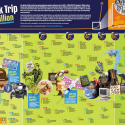
The student contest challenges students to create a short video that connects human population growth with one...
Colorful, informative poster makes the perfect classroom wall decoration – it inspires conversations and questions. What historic...
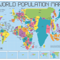
Cartogram poster provides students a unique view of the Earth – the size of each country is...
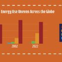
Comparison of energy use per capita over time based on wealth.
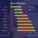
Graph displays the fertility rate and mean years of schooling for nine countries.
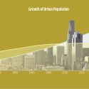
Number of people living in urban areas vs rural areas starting in 1950 and projected to 2050.
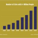
Historic growth in the number of cities with over 1 million residents from 1960 to 2030.
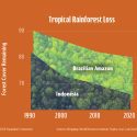
Forest loss in Indonesia and the Brazilian Amazon as a percentage of 1970s forest remaining in 2020.
PopEd Impact
campuses
"The activities not only bring out important content, but they also provide real-world context for environmental, population and sustainability issues. They engage participants in very thought-provoking and critical-thinking discussions.”
Helen de la Maza, Environmental Educator, Irvine, CA